Animation in Website Design
Analysis & Showcase
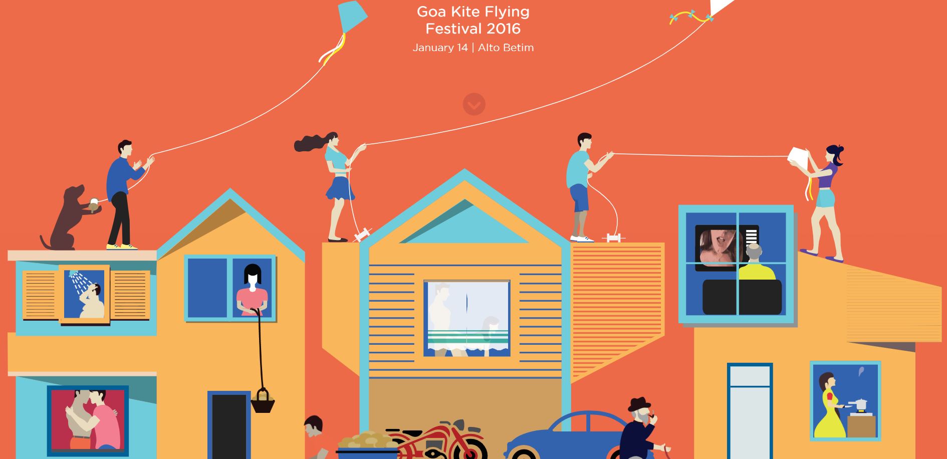
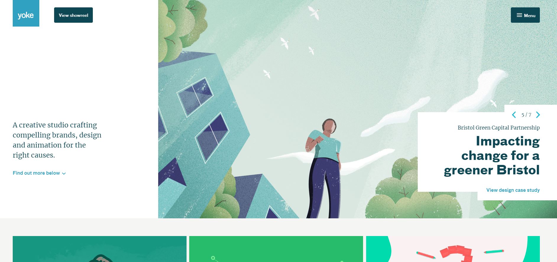
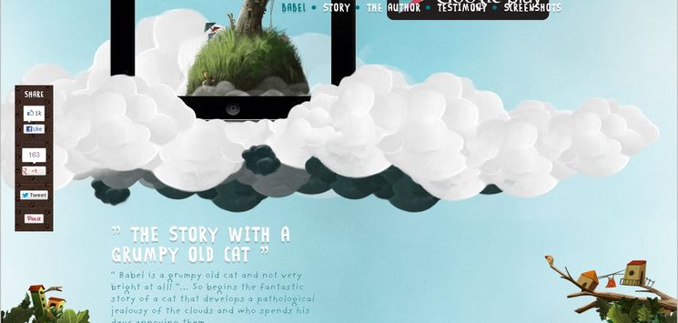
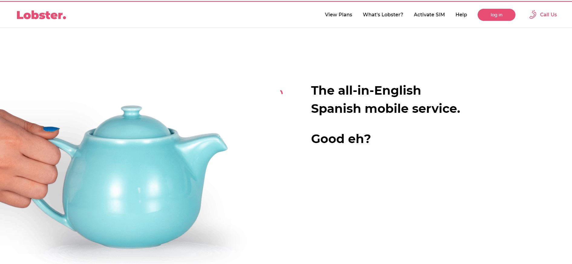
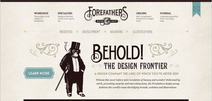
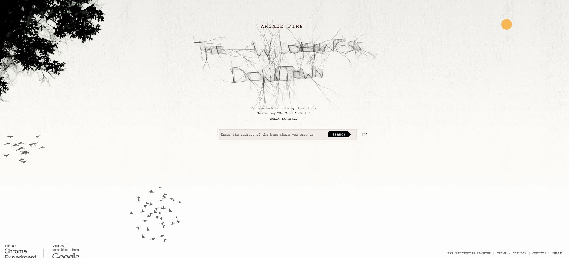
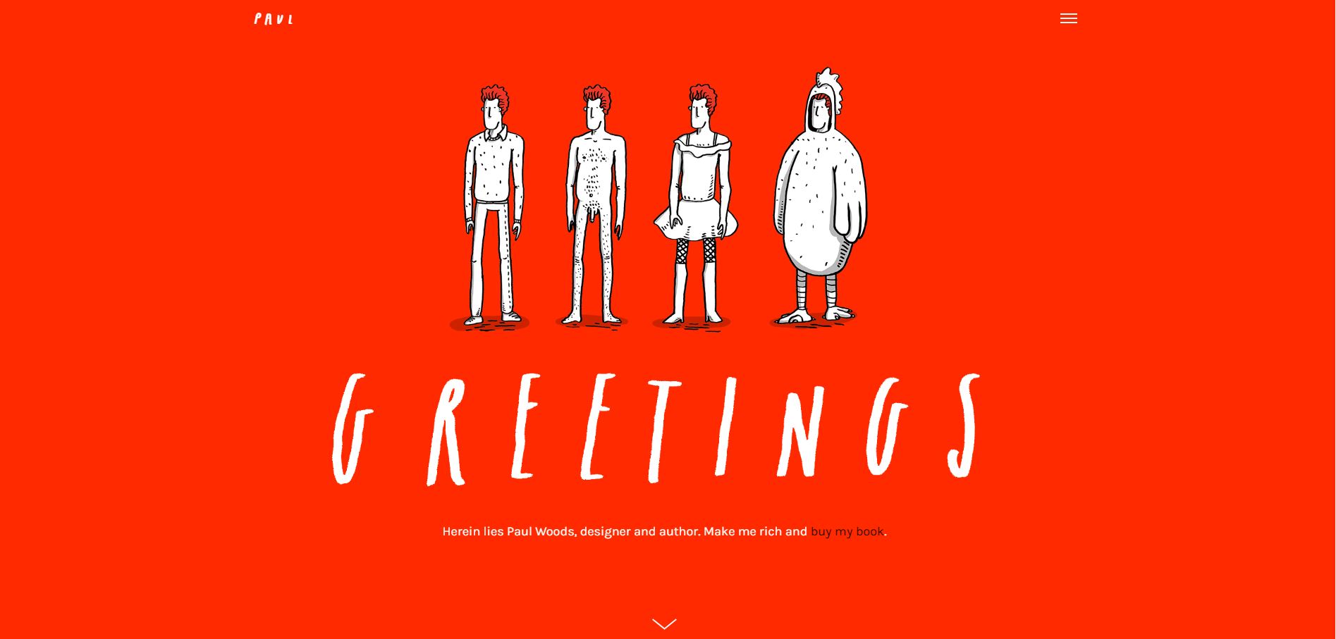
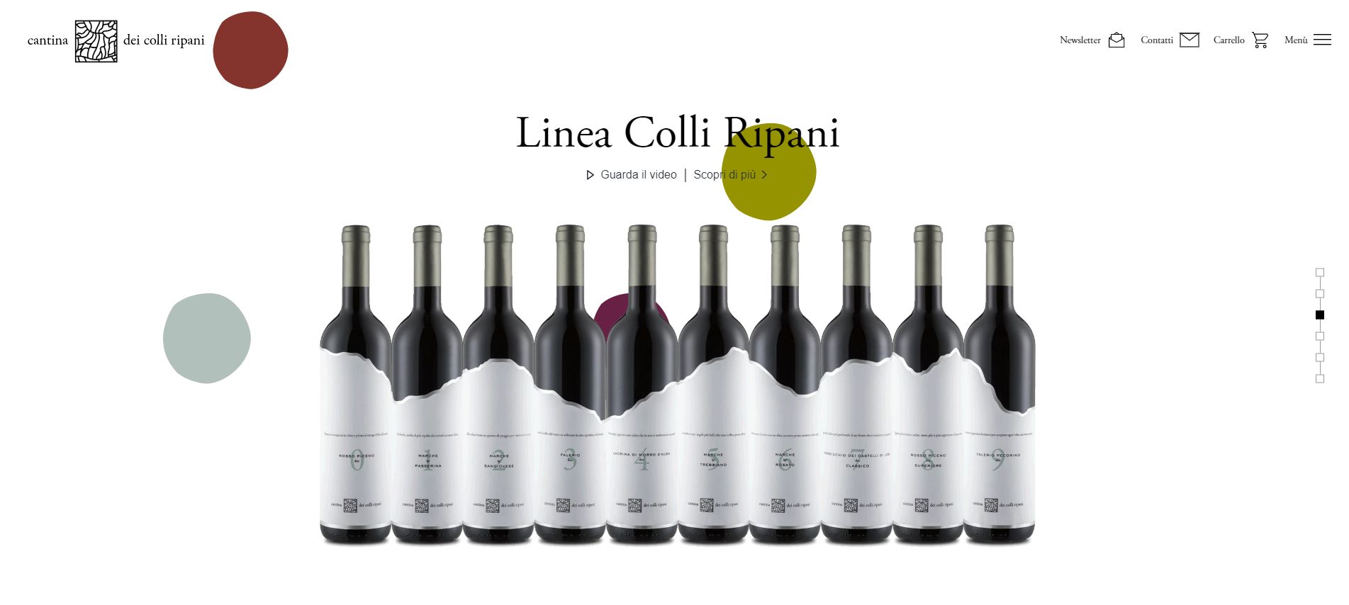
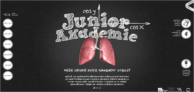
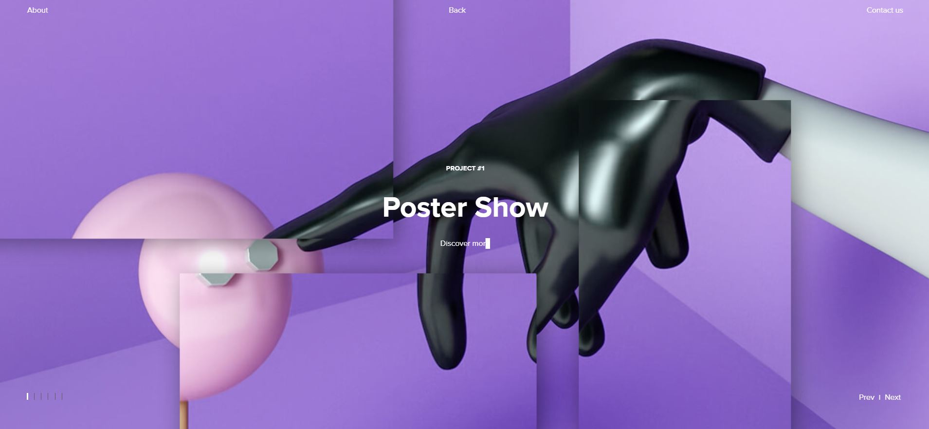
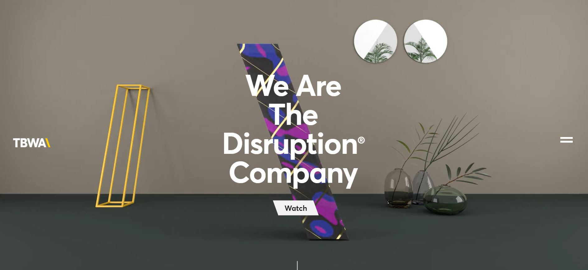
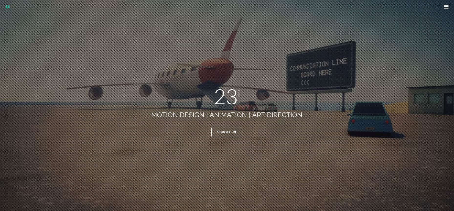
Animating elements in website design perform both a functional and an aesthetic purpose. Since human beings are illusionist creatures, anything that appears to be alluring to the eyes entices them. Animation is an effective means to bring about the visual magic of virtual motion that engages people. Further more, what makes animation fashionable is the subject area of realism. In computer animation, the scene is rendered to recall a real thing that is natural and believable. Animated website trend is one of the most interesting and popular design style — something that we are starting to see more of every day. This web design technique makes a website more attractive and consequently draws more users in. Being an effective tool for visual communication, website Animation style provides a whole new instrument for expression and creativity. It is trendy, fun and user friendly.
The Evolution of Animation
Animation is all about movement. The key point is to give a soul to design elements. One of the words that is nearly analogous to animation is Disney. The 12 principles of animation were first introduced in the early 1980s by two of the companies’ top animators, Ollie Johnston and Frank Thomas. Using animation in web design started a while ago and since then — like other website trends — has been developed a lot. The smartphone revolution disrupted almost all industries. As a result, Animation web technique was further advanced to meet the new requirements. This was mainly achieved by the help of computer-generated images. Animation technique, however, is regarded as one of the most complicated parts of the graphic design for websites. The reason is that it is generally time-intensive and demands high-speed computers and sophisticated software.
usability & functionality features of Animation Websites
Employing animated elements is a great way to improve both the usability and functionality of a website. Animated items are used to better conversions and visual feedback, show where to click, indicate errors in forms; and much more. The following is a description of some of these features:
- Highlight Actions:
This is achieved by using micro-interactions — small events where the user and design interact. Their main purpose is to enrich the user's experience with the design. This class of animation accomplishes two purposes. Firstly, it gives viewers a visual feedback when they interact with an element. Secondly, it provides users with information on how to use it. Here are practical situations where you can apply them:
* To let users know a particular action was successful.
* To highlight when users turn a feature on or off.
* To emphasize specific pieces of information.
- Display Hidden Information:
Hover animations are an efficient way to bump up the information provided in a limited available space.
- Distract users During a page load:
Although the internet is faster than it has ever been, loading time is still a major issue for most websites. It can make users so much impatient that they leave the site. Using animation is a hyper-efficient means to distract viewers while a page is loading. They can even have fun watching while waiting. Applying simple, flat shapes are the rule of thumb here.
- Reveal Hidden Menus:
Generally, menus should always be visible. However, in some instances, using hidden menus make sense as far as they are easy to access.
CONCLUSION: When to Use Animation?
Using animated design elements needs to fulfill a purpose. When applied thoughtfully, animation greatly improves users’ experience — which should be the primarily reason behind implementing it as your preferred website style. Yet in some instances, the goal of an animated element can just be a stylish one. There’s nothing wrong with wanting an aesthetic website, if the ambition is to create visual interest images that in turn leads to keeping users engaged with the site for a longer time. Nonetheless, it has to be smooth, seamless and done in moderation. Otherwise, too many animations can result in a visual overload, slow down the website; and most importantly can get in the way of the content. I repeat once again what Luke Clum stated some years ago, “No matter how you slice the pie, at the end of the day we all need to provide detailed content for our readers, not just pretty images. “
Finally, it is worth mentioning that ‘timing’ is one of the most important factors included in a well-implemented animation project. It provides physical and emotional meaning to an animation by giving viewers the right feeling and understanding. If an animated website has problems with the timing, the users could lose encouragement for further engagement and exploration of the site.
NOTE: Some of the animated websites can take longer time to load. Thanks for your patience.

