Collage Web Design Style
Analysis & Showcase
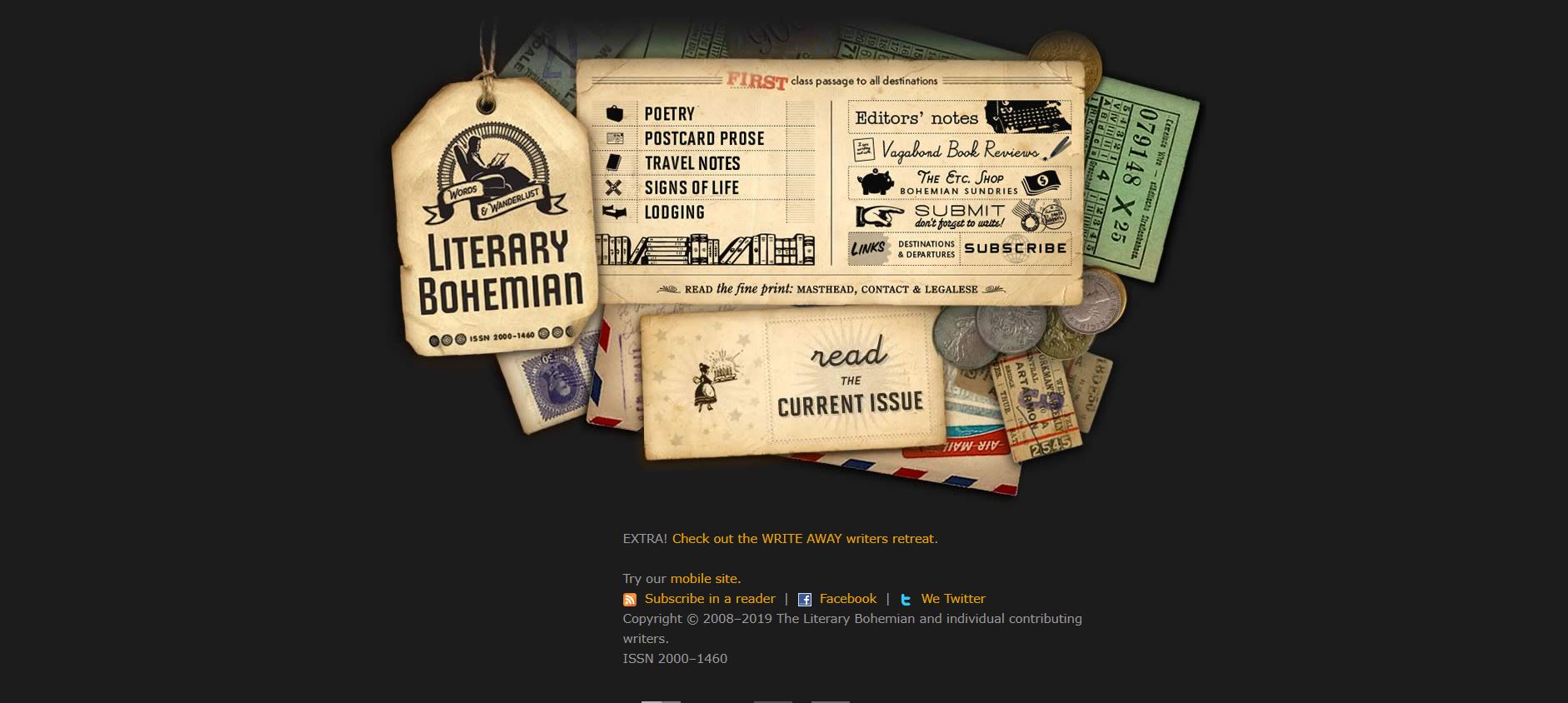
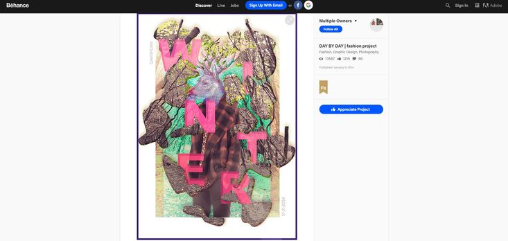
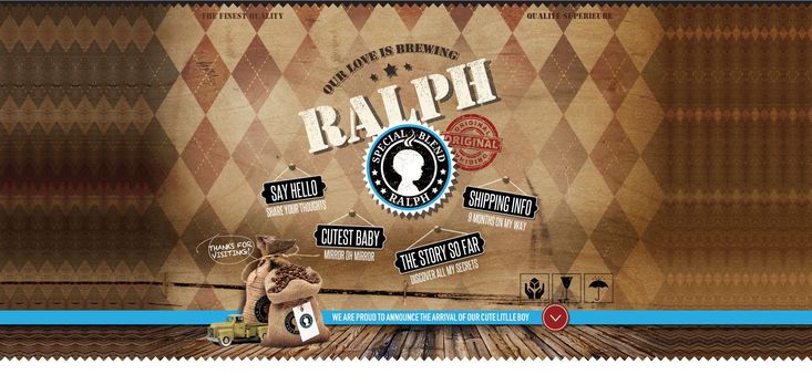
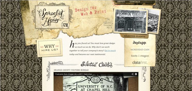
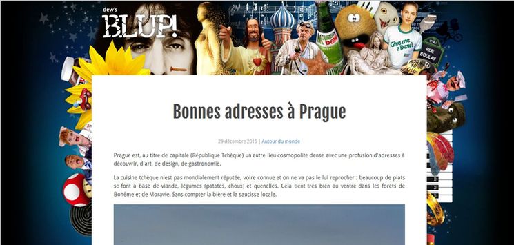
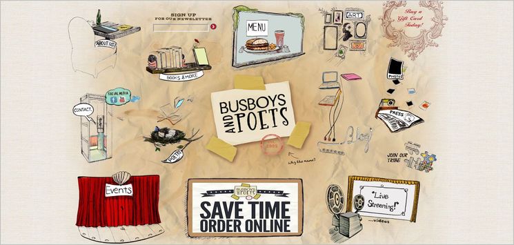
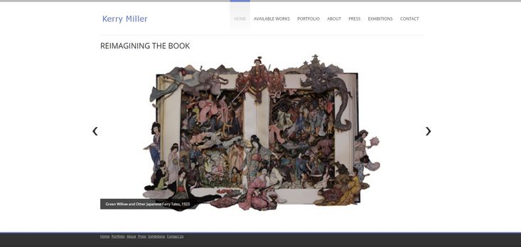
Compared to traditional websites, Collage style websites are unorthodox, visually creative, interesting and can be cool fun facts. Collage websites deserve more attention, because they are quite unique and eclectic; their layout designs diverge into many avenues. In other words, they can be as varied as the websites that apply them. The popularity of Collage design style has been increased over recent years, particularly by Flash designers.
What Is Collage?
The term collage comes from the French word coller meaning 'to glue'. As a part of modern art, it is referred to a design work created by assembling random flat items such as photographs, newspapers, ripped paper/cardboard, paper tags, printed texts, etc. This artistic process become popular around the 1920s by Pablo Picasso, his rival Henri Matisse and later on by other artists including Hannah Höch and Romare Bearden. Each of them — by implementing their own special method — began using collage as a more modern approach to making art in an entirely new way.
The Benefits of Collage web design
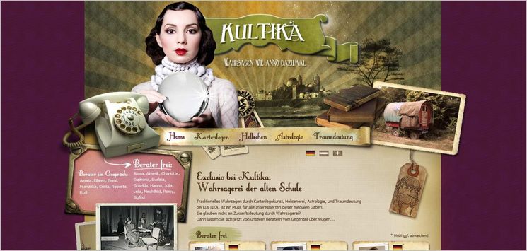
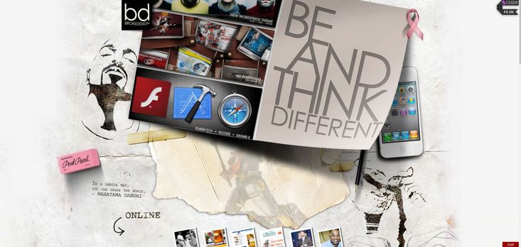
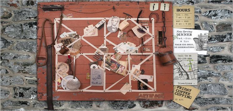
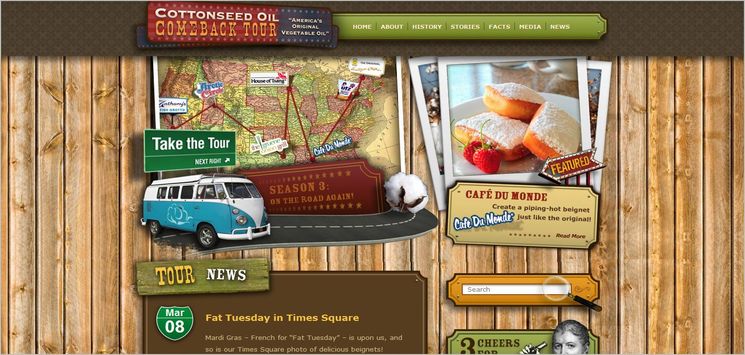
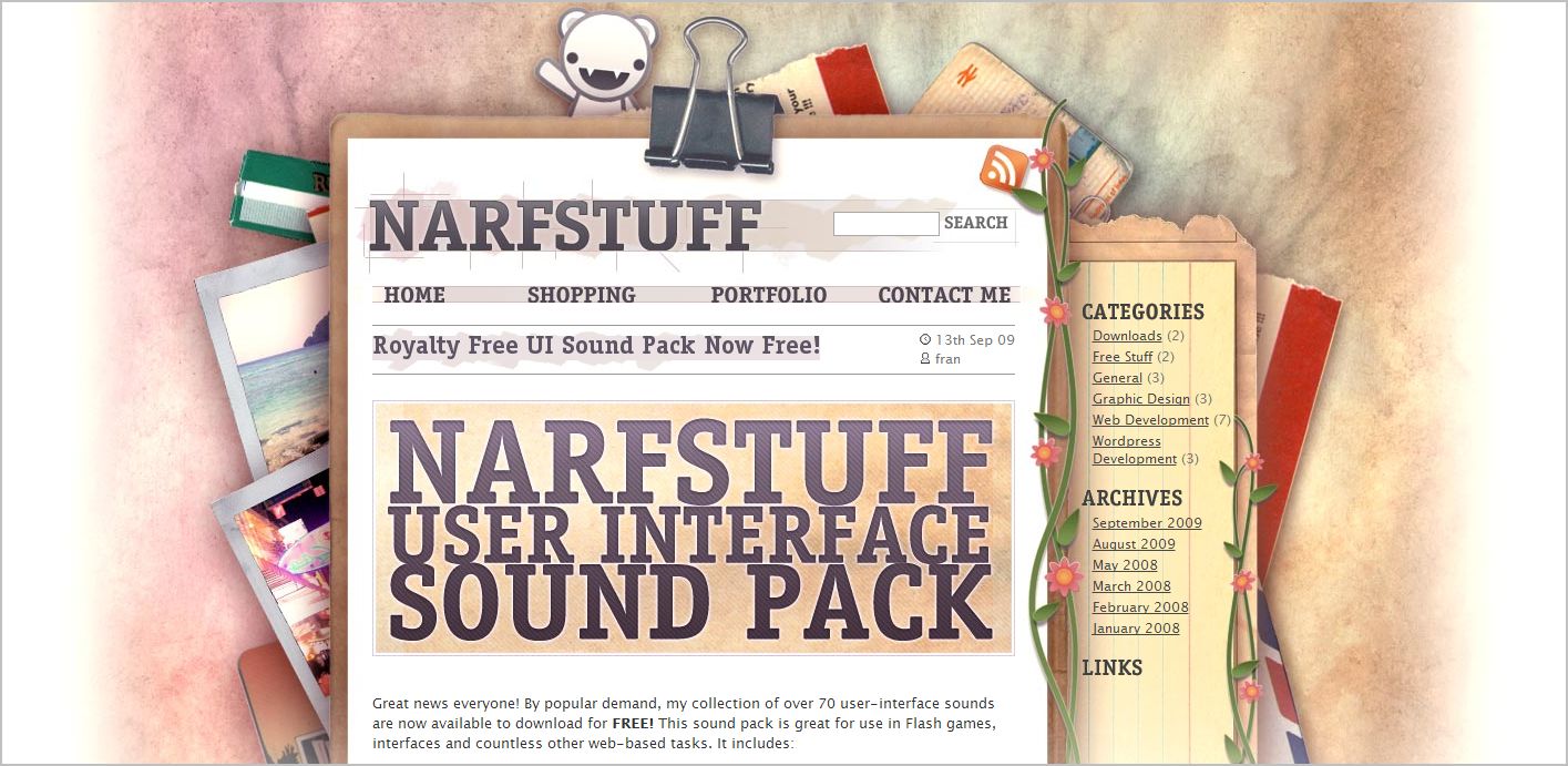
Since Collage web designs can be very different from each other in terms of look and feel, there is room for a lot of individual expression through what to be included in the layout. Also, the designers have more flexibility to select from a bunch of graphical elements (like typography, patterns, images, colors, icons, etc.) to create a background. This background usually resemble a bulletin board or messy desk. To assemble different forms to create a new whole, designers mostly utilize images (and especially real-life photos) to form an interesting scene. Ideally, the best layouts are those that do not focus solely on aesthetics but instead designs that contain content as well. In collage-styled websites, the navigation and the flow of information is usually incorporated into the scene.
Canva
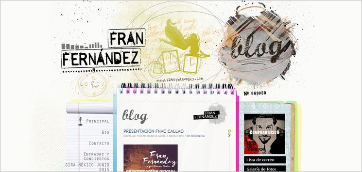
Fran Fernandez
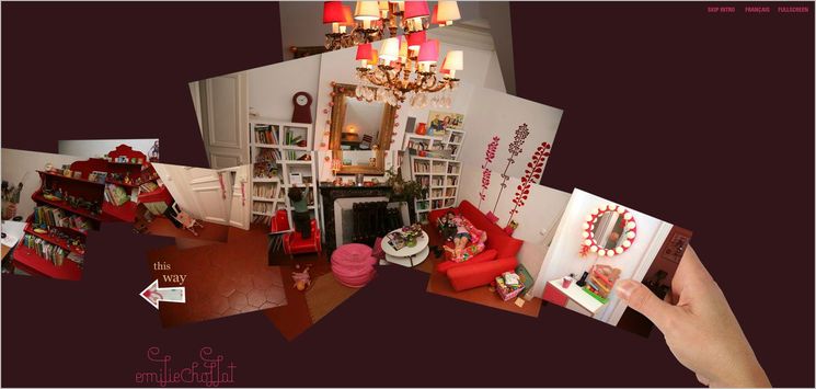
Emilie Chollat
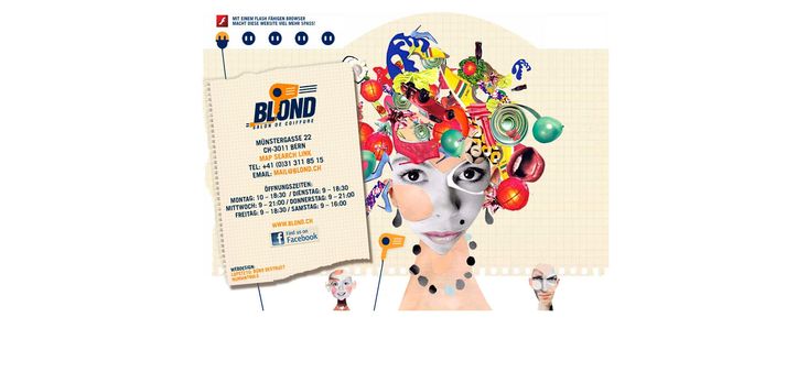
Blond
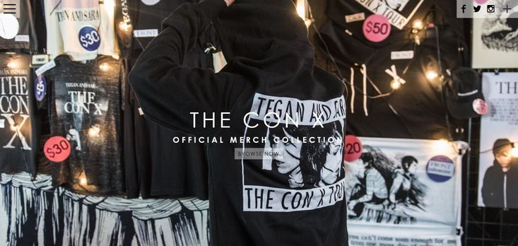
Tegan & Sara
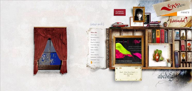
Foxie
