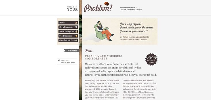
Retro (Vintage) Web Design Trend
Analysis & Showcase
What is Retro/Vintage Web Design?
Retro or vintage inspired web design is about relieving the past trends by using design fundamentals from passed decades. This design style is among the most interesting and acknowledged web design trends. The word retro is actually a shortened version for retrospective which means backdated, backward-looking or related to the past. The terms retro and vintage are usually used interchangeably in web design context. Both of them refer to the same web design style; a website design that pays tribute to the glorious designing style of the past by using visual nostalgia elements. Nevertheless, retro and vintage are generally two different descriptive labels for designed objects as in paintings, ads and fashion designing. Vintage was first used in reference to a wine's age. It usually refers to items like cars and clothing that are less than 100 hundred years old. The term retro can also be an application to any revival or comeback trend and should only be referred to copies of vintage items. Retro clothing — which mimics the style of vintage clothing — is made with an old design style by using contemporary materials. Retro generally implies a vintage of at least 15 or 20 years. In terms of age, retro clothing is newer.
Why to use Retro Design?
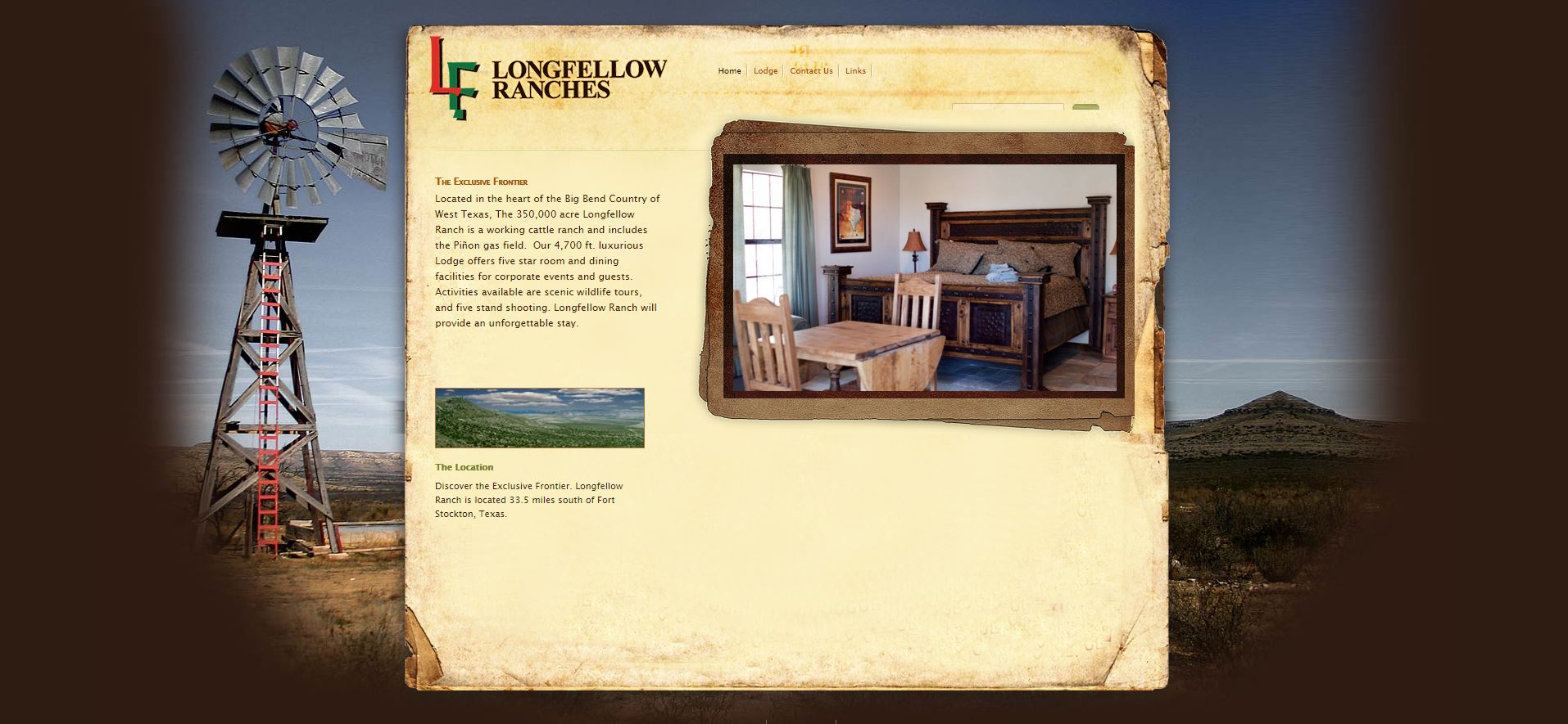
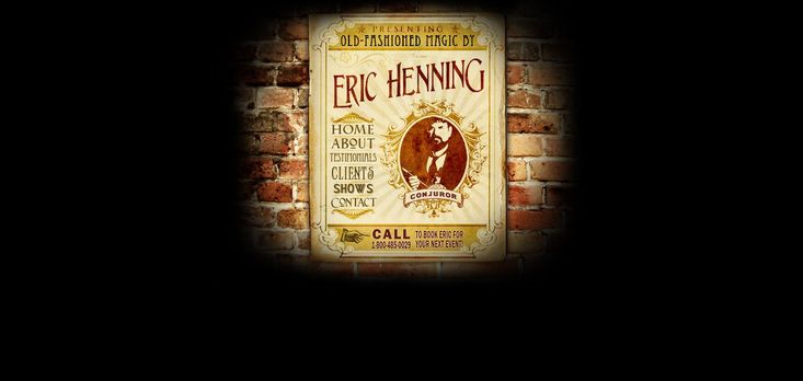
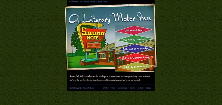
Retro style has brought a touch of romanticism in web designing. By transcending time, styles, tastes and ages, this design trend stands apart from other web designs. Through interweaving modern graphics with old pictures/designs, a retro web design creates a vintage look and feel. This style is commonly used to sell a product or service with styles that originate from anywhere from the 1920s to the 1970s. It seems to be very popular on travel and tour websites. While this design trend can be employed by any business, there is an important factor involved which has to be considered. The rule is that your brand should already have a retro aspect or value in-place, simply because people have a tendency to associate value with old things. Furthermore, careful usage of motifs, objects and trends of the past is essential in order to create a nostalgic environment. The outcome assists the website to capture attention of the targeted audience. When incorporated properly, you will be able to connect with your targeted audience on a deeper emotional level.
Distinctive Features of Retro Design
Vintage shapes, borders, textures and ornamental elements are a vital part of any well-done retro design. These features distinguish a retro from other design trend. The following is the detailed descriptions of these characteristics:
- Colors:
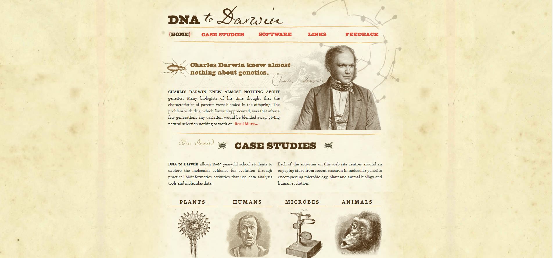
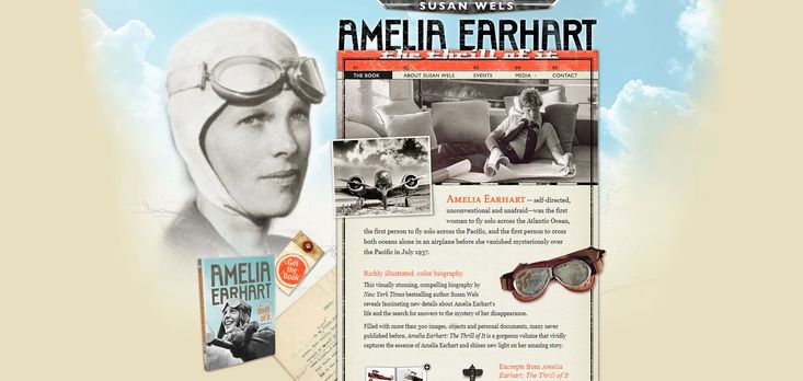
Limited use of colors is the noticeable trait of retro designs. In fact, full color printing was very expensive in the past. It led designers to limit the applying of colors in their designs. As a result, two toned coloring was basically used by retro designers. Dark orange was usually a popular choice in vintage designs. So todays’ designers follow the old classic rules of using only two colors. It additionally gives the design layout a more old-style look. In retro layout, colors are neither too colorful nor too dull. In order to give a website a retro look and feel, the use of bright color combination is out of the question. It goes against the premise of retro web design. The saturation level also plays a crucial role in this scenario. It has to be reduced to some extent in order to make the images look old. This is a common technique employed by web designers to lend a vintage look to the pictures.
- Typography:
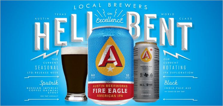
Typography is definitely one of the important elements in Retro web design style. If the wrong font type is chosen, the design will lose its impact and appeal. For designing retro style designs, appropriate retro style fonts are essential. You need to select those font types that help in the process of making the design look a bit old. Those retro fonts specially designed for headings or larger text sizes are not good at small sizes. Among the popular retro fonts are the following: Streetwear, Zorus serif, Harlott, Bobber, Canter, Sesame, Boomtown Deco, AkaPosse. These fonts pass the information to the design within the same design pattern. Besides, handwritten scripts are also used.
- Textures:
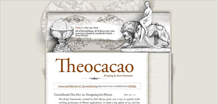
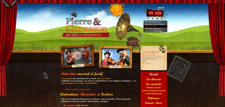
Unless the right texture and the right amount of noise are applied, the design will hardly look like a retro design. Paper texture is widely used to give the design a vintage look and feel. Wooden texture, crumpled papers, coffee stains, etc. are good options for this purpose as well.
- Ornamental Borders:
In order to give the design a true retro look, ornamental border plays an important role. It is a traditional feature that will probably never die as long as retro design is around.
- Shapes:
Traditionally, simple shapes works wonder in creating a retro look. Above all, circles of different sizes are a good choice. Observing the works of the famous designers of the past eras revels how simple shapes were used by them to create a long-lasting impression. Most of the Retro web designs are inspired by old age posters. Images that are used in retro design also have faded color schemes. In addition, period icons and vivid graphics are utilized to accentuate an era the designer referring to.
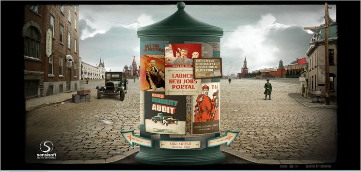
Sensi Soft
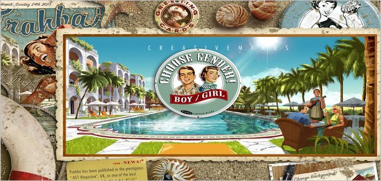
Boy & Girl
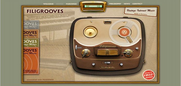
Filigroovers
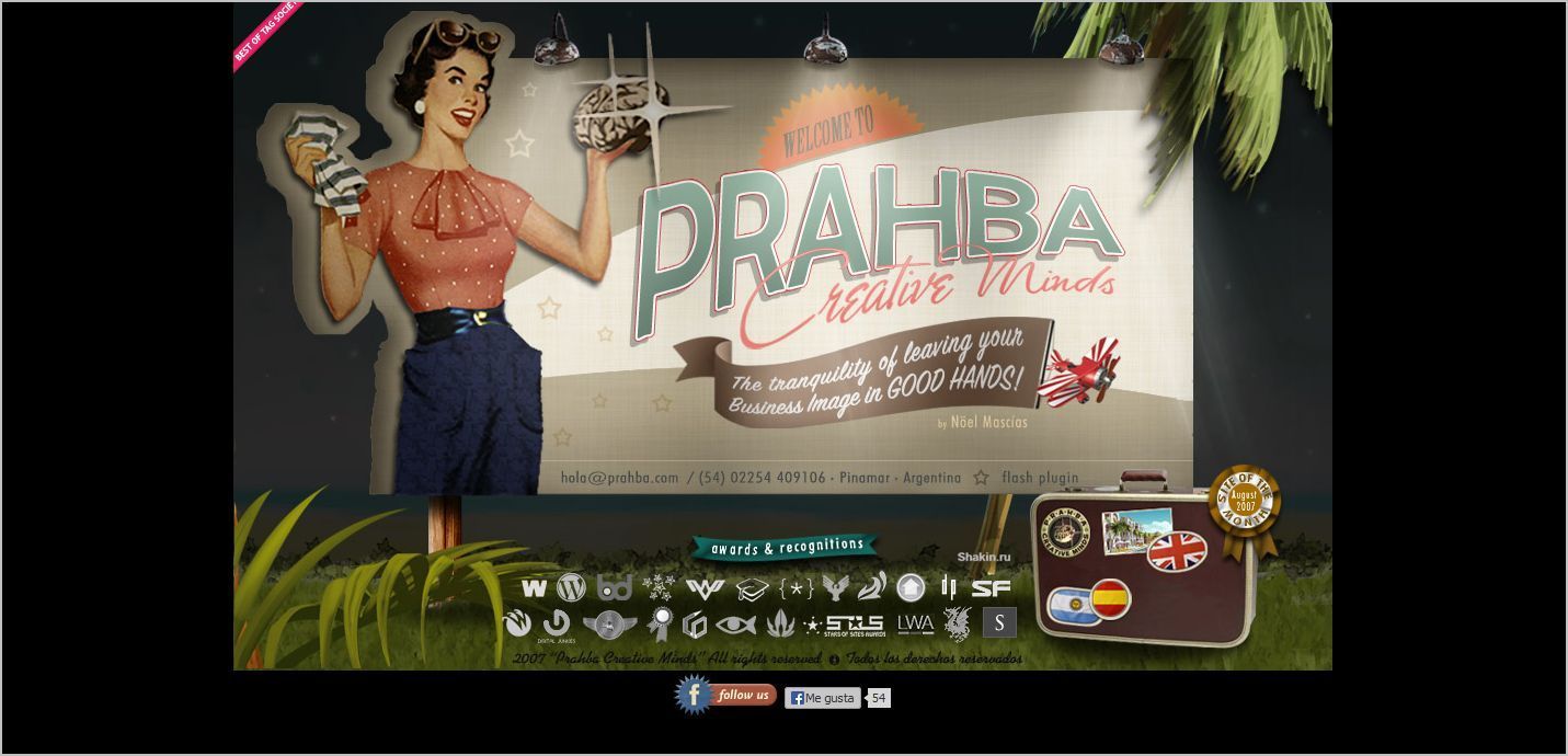
Prahba
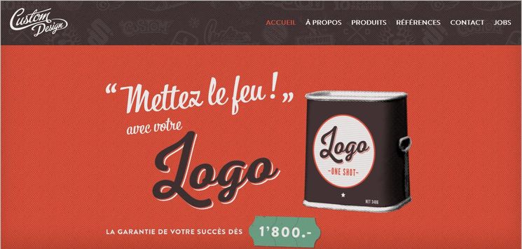
Custom Design
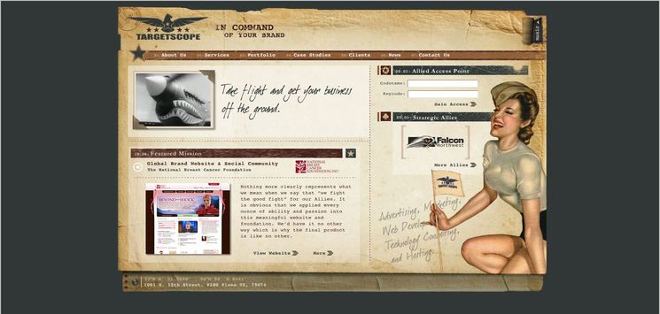
Targetscope
