Flat Web Design Style
Analysis & Showcase
What Is Flat Design?
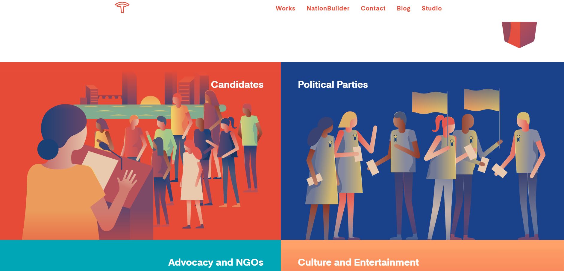
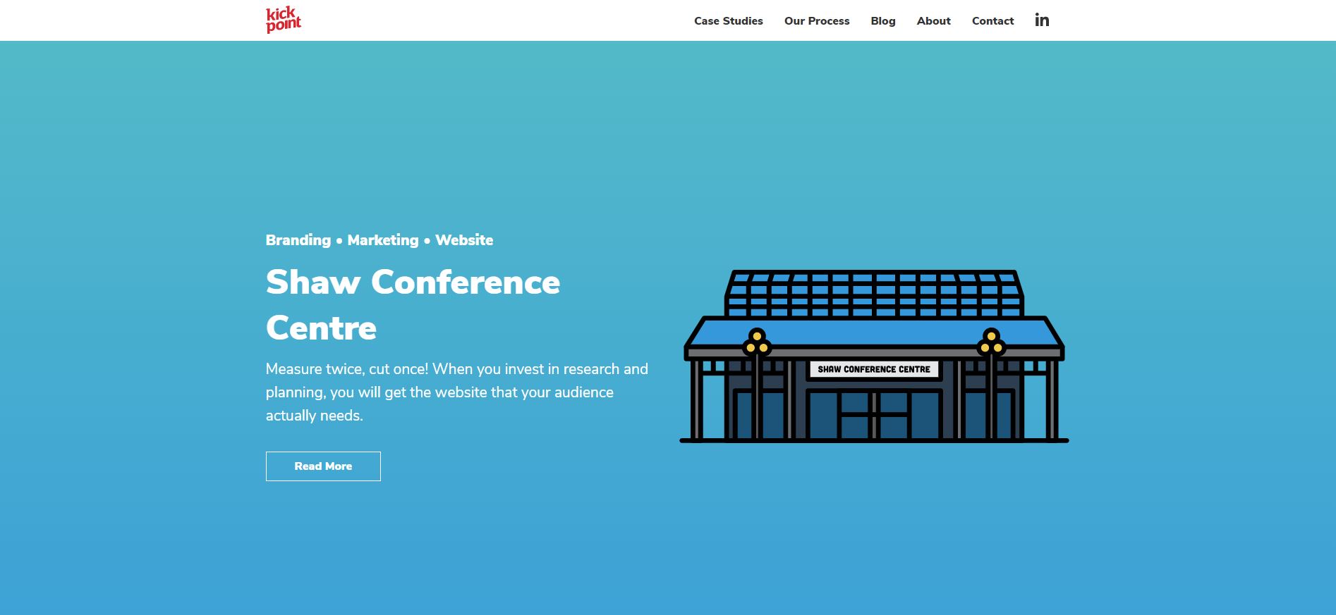
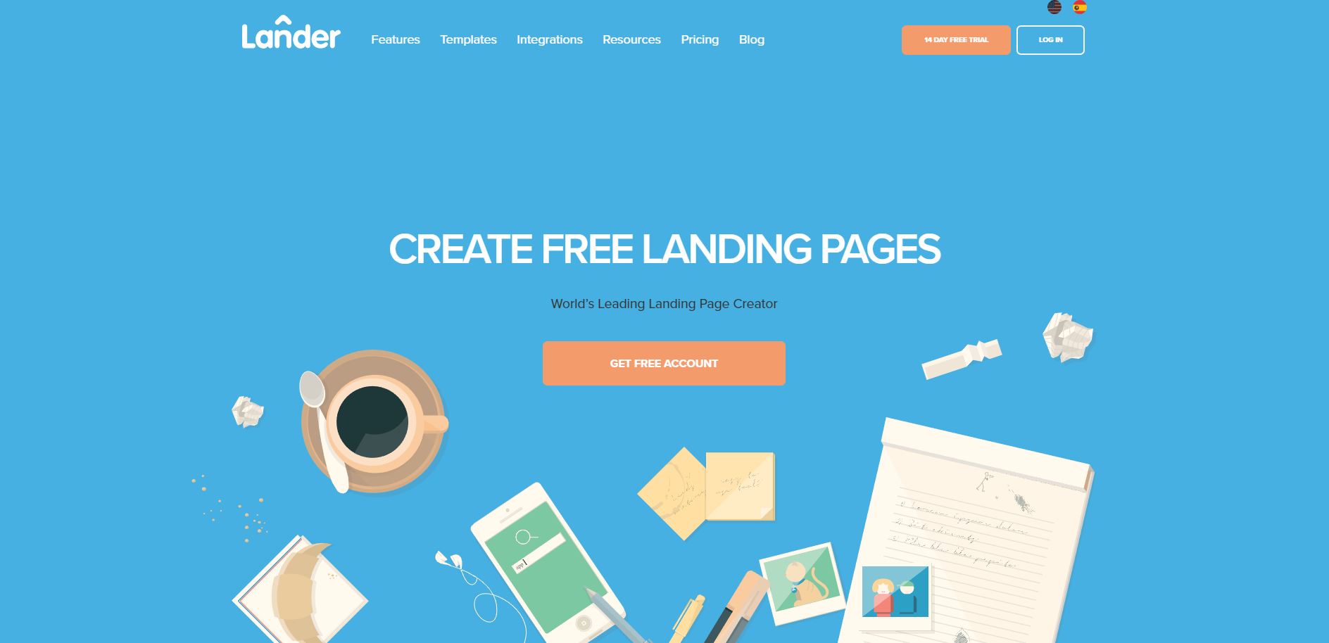
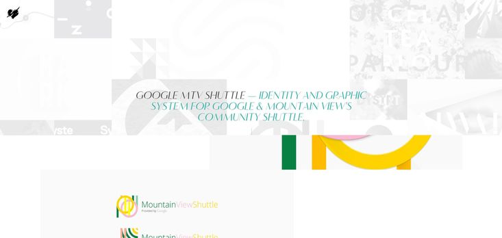
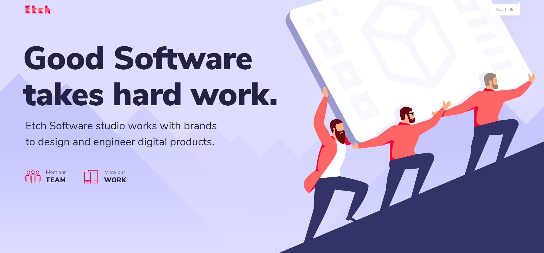
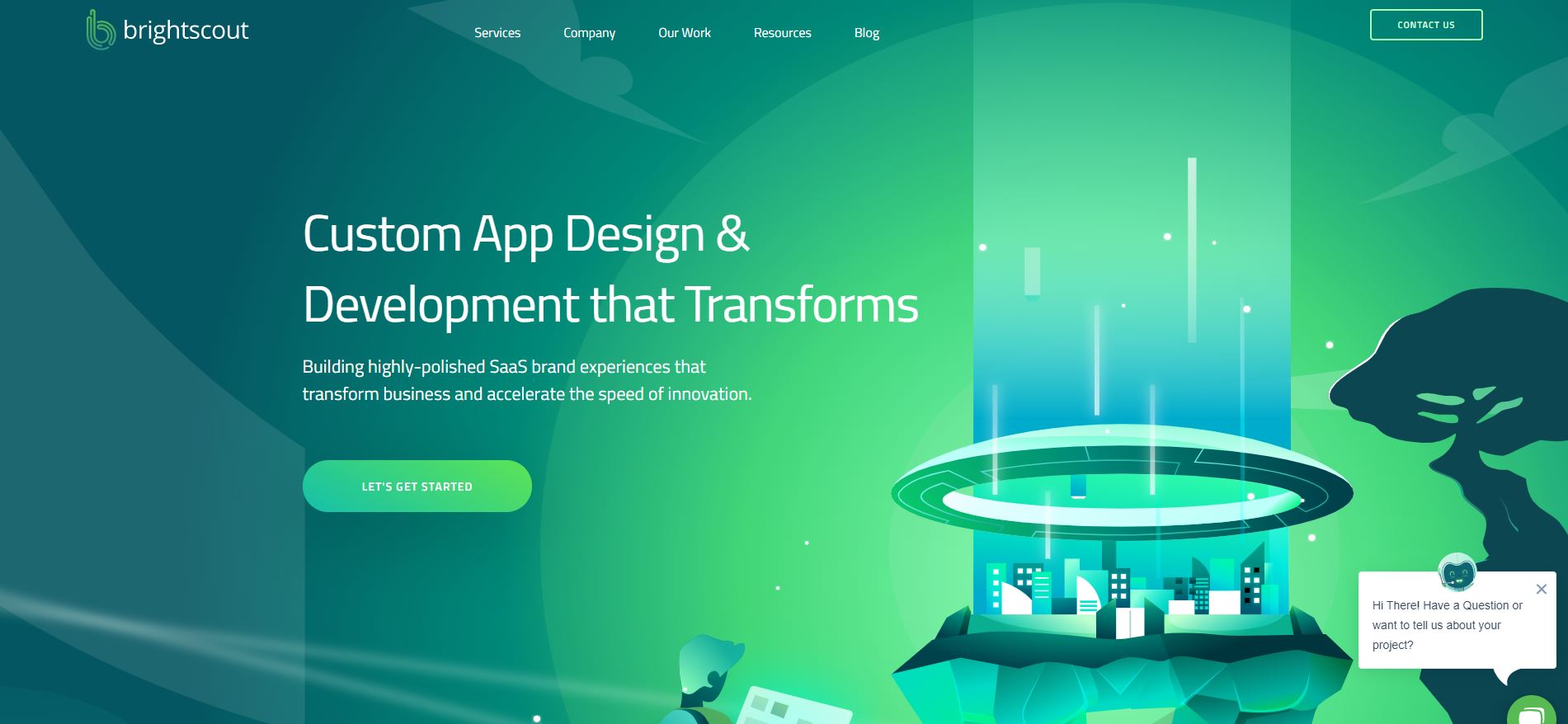
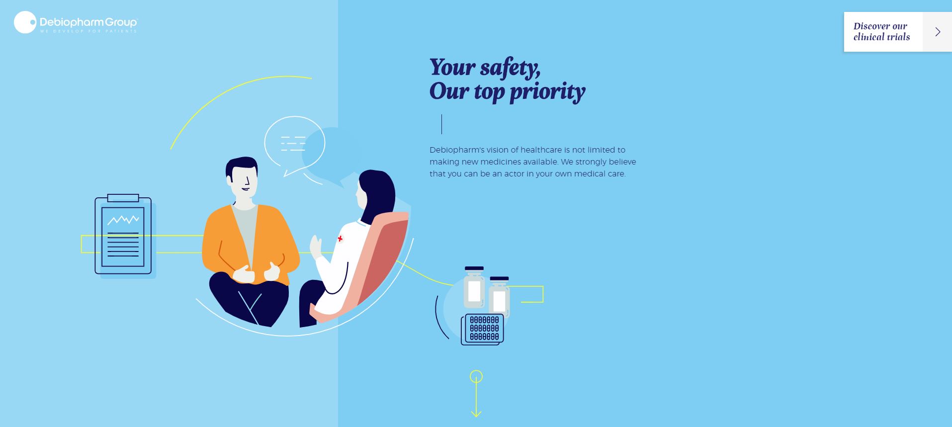
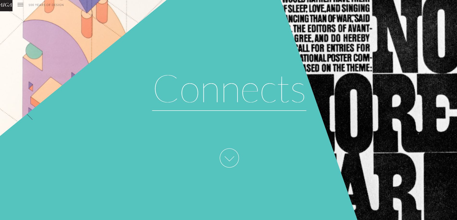
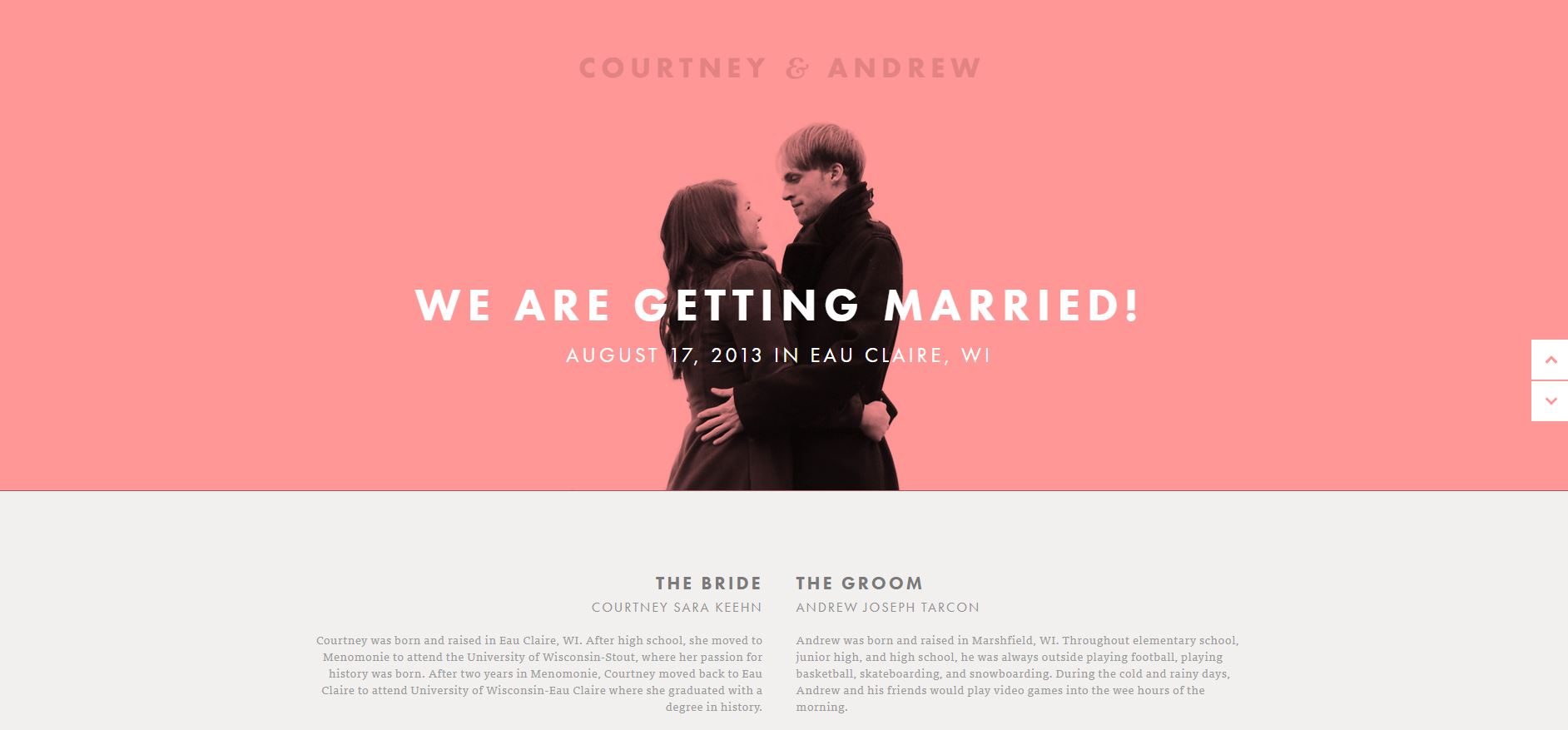
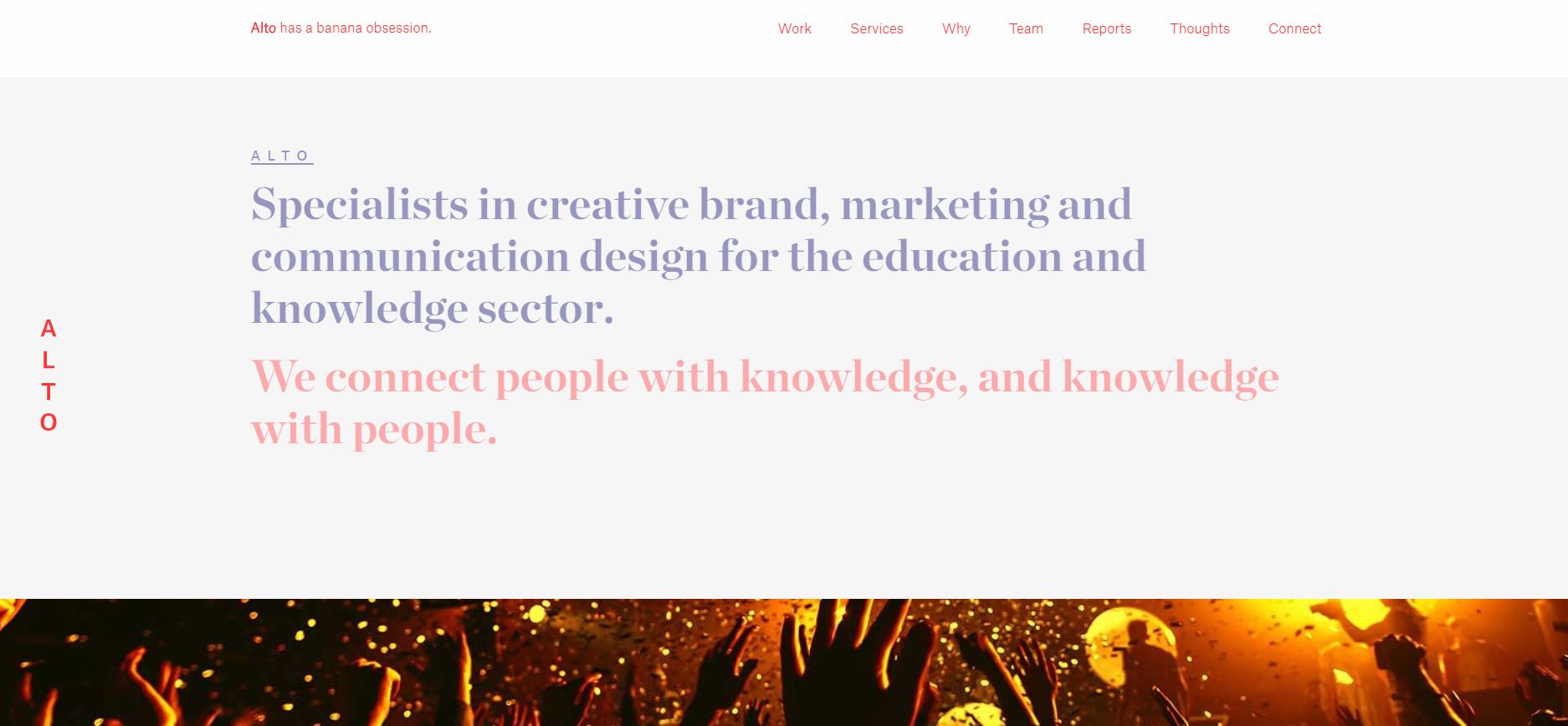
Flat design is a clean and simple web design style that has a clear-cut look and feel with minimal aesthetic design elements. Although this design trend utilizes two-dimensional elements, by employing some design techniques give the illusion of three dimensions. Instead of relying on aesthetic elements, — like real images, drop shadows, gradients, and textures — Flat style emphasizes using contrasting bright colors, clean lines, illustrations with simple imagery and white (negative) space. The summation of these elements get together to deliver an outstanding user experience that is very visually appealing.
The major purpose of this web design is simplicity and thereby enhancing usability. It makes projects easier for users to understand and interact with. Furthermore, using Flat design is a great way to improve the speed requirements for websites that nowadays search engines demand. The use of Flat technique is particularly popular in mobile web design. Flat trend has been around for quite some time and it dose not look like it is going away in the near future.
The Origin of Flat Design
Most often, design movements have their roots in other design concepts. Flat design falls into this category as well. It was originated from Minimalism, Modernism, Swiss style, and Bauhaus. From an aesthetic point of view, Flat design trend was mainly inspired by the Swiss style. Flat design was created in response to skeuomorphic design. Strangely enough, there is a sharp contrast between Flat design and Skeuomorphic style in many respects. The concept behind Skeuomorphism is to make items resembling their real-world counterparts. In other words, Skeuomorphic design is more intuitive from the users’ point of view, because they employ objects that are closer to reality. A detailed description of Skeuomorphic web design is presented in a separate article.
Major Features/Benefits of Flat Design
- Minimalist Approach:
Having its roots in Minimalist design. Flat style focuses more on simplicity. The design excludes gradients, drop shadows, and or other tools that add depth. So, it does not make elements look like realistic.
- Functionality:
The functionality is the central aspect of Flat design. The objective is to make it more efficient user-friendly. Especially when it comes to the design of the app, the user will focus more on what is important. To achieve this goal — as previously mentioned — Flat design focuses more on simplicity by leaving out gradients, drop shadows, and all other extra items. So I recent years, web designers and developers, by utilizing this design approach, have greatly improved mobile performance.
- Faster Load Time:
Since image-heavy websites load slowly, it annoys mobile users. Through centering on simplicity and not having large amounts of extra data to load, Flat style makes the graphics load faster without any hitch. As Flat designs are characterized by loading quickly, they are nowadays trendy for another significant reason as well. Websites that are build upon this design technique usually hold higher SEO value and consequently are more likely to rank well. Because, these websites deliver faster load times which Google, Bing, and pretty much every other search engine are starting to require.
- Focus on Color:
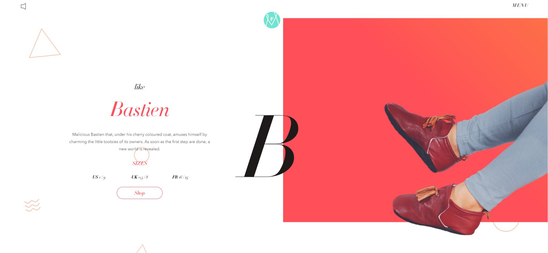
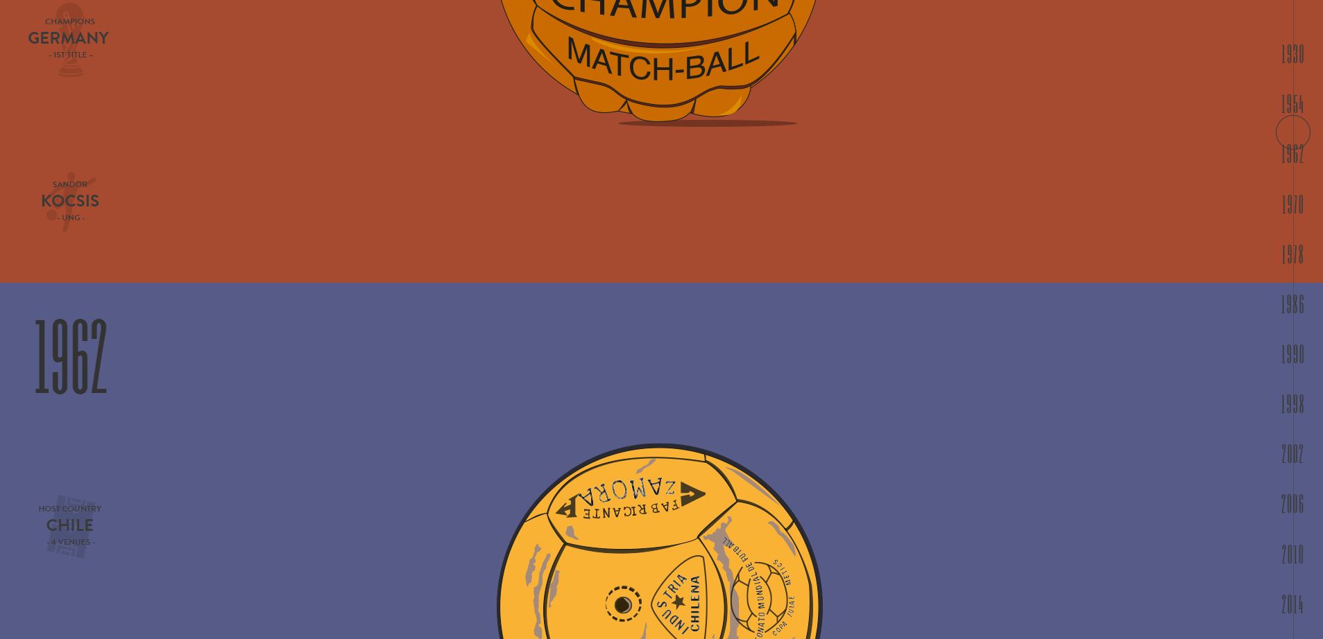
Due to the simple nature of element in Flat style, contrasting bright colors and typography are very much focused on. Colors are a major part of Flat design. Flat design color palettes are generally more colorful than those for other design styles. This means that the color scheme contain many more hues, which tend to be vibrant. Moreover, certain types of colors are more frequently applied. Especially, colors used in Retro design are favored.

