Texture & Pattern Design Trend
Analysis & Showcase
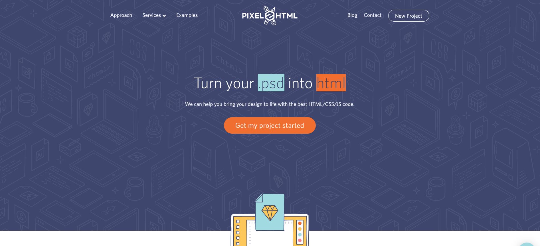
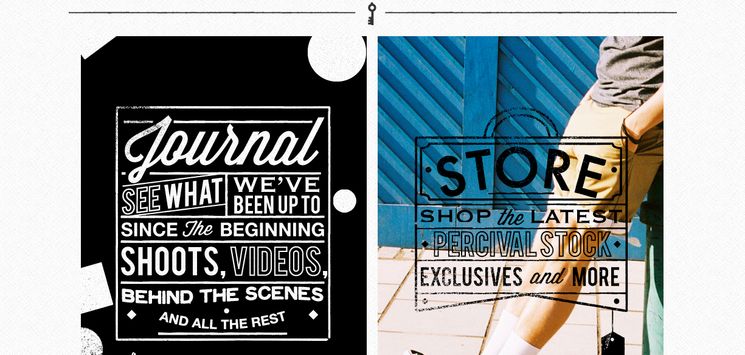
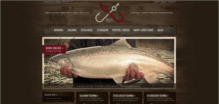
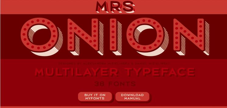
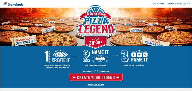
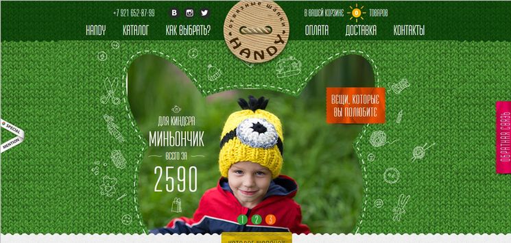
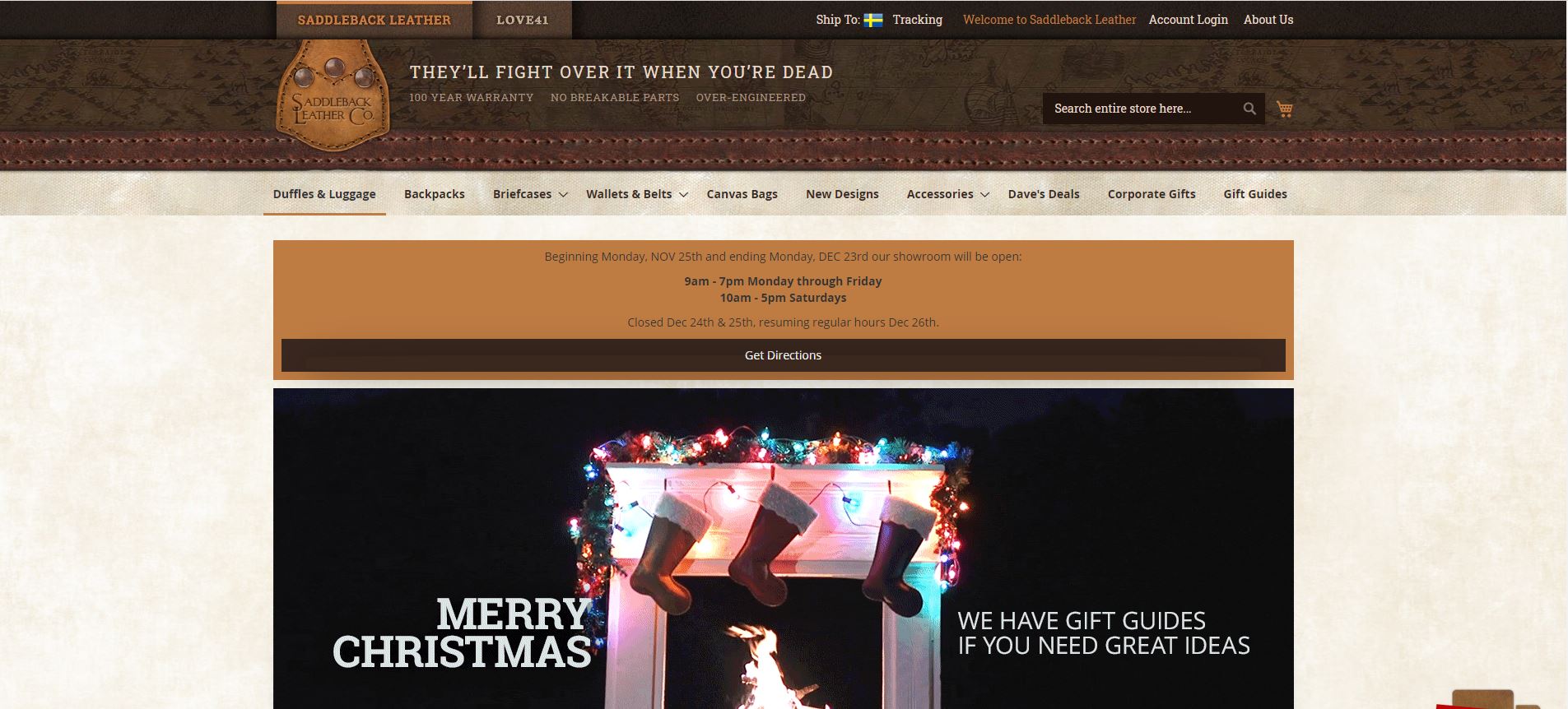
Subtly textured/patterned backgrounds are a very popular choice for giving a realistic feel to a web design layout. When applied properly, Texture & Pattern website design creates a sense of strength, depth and tactility to your layout. The result is a unique and stunning visual look that leaves a lasting impression on the visitors. By utilizing different degrees of textural content to a layout, the design will appeal to the tangible senses of the end users. It is as if they want to reach out and touch the screen.
Before we go further in discussion of this style, it should be noted that there is a distinction between terms texture and pattern. So, an explanation about the technical meaning of these two words seems helpful. In general, a texture is felt and a pattern is seen. In other words, texture refers to the sense of touch while pattern is more a visual recognition of some repeated elements. In contrast to pattern which is two-dimensional, texture is three-dimensional; you can feel it, if you could put your hand on it.
Texture & Pattern style has been a popular web design trend for years now. This design has been applied in varying forms based on the degree of usage of texture/pattern. In its most cool and subtle look, texture is usually used as monochrome (tone on tone) and achieved through shading techniques. Texture is utilized mostly as the background and also to fill white spaces on a layout. Patterns are typically small, repeating, tile-like elements, and in more than one color. Therefore, the process of mixing a texture in a design is relatively easier than mixing a pattern. This web style is also employed in combination with other web design trends, for example in Grunge web design.
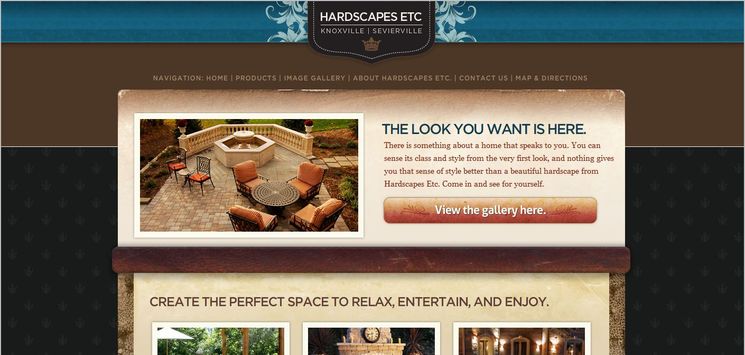
Hardscapes etc.
