Magazine-Styled Web Design trend
Analysis & Showcase
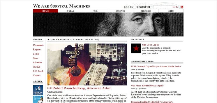
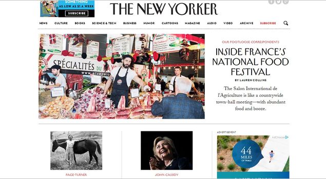
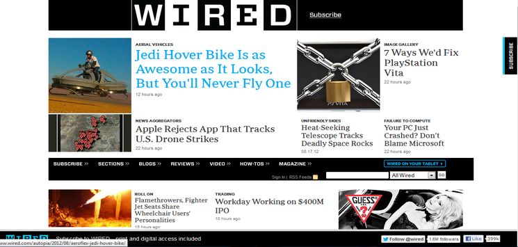
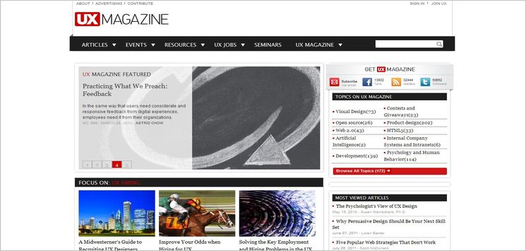
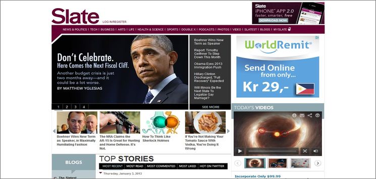
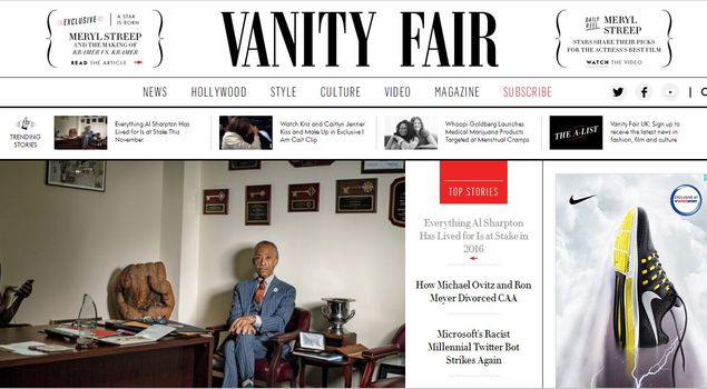
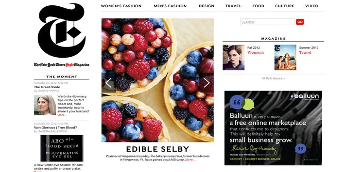
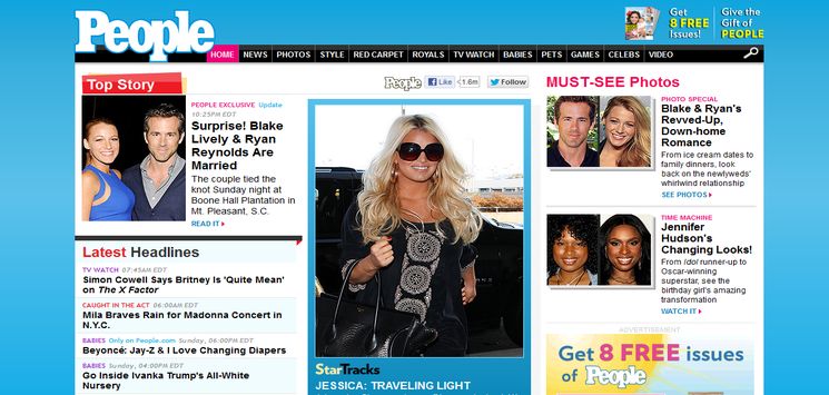
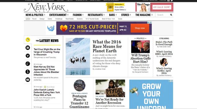
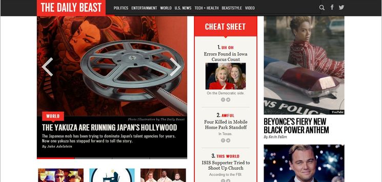
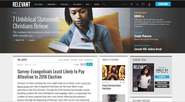
Magazine-styled websites are visually distinct from traditional designs by their multiple columned grid-like design layouts. They have become more popular nowadays and are commonly used for online magazines, blogs and news related websites. However, other type of websites with lots of contents like the entertainment, media and corporate sites are also taking advantage of this trend recently. Thanks to the ever evolving web technologies, websites with magazine design style have changed a lot over the last few years. Consequently, modern blogs have grown into a new era of editorial design. A new age of digital content has risen to popularity.
features of Magazine-Style Web Design
Magazine-styled web design makes the layout more attractive and much more technically balanced. Since there is often a large amount of content, it requires careful organization, presentation and updating of contents. Unlike other web styles that can utilize large images as compliment to the design, this style is limited to being constructed within the parameters that the content-oriented site dictates — mostly texts and some small images. The following is a list of features associated with Magazine theme web designs:
- Content-oriented:
The sites using this design trend are traditionally content-heavy websites that have a lot of texts and a few images
- Well-organized:
Since this web design utilizes Grid-based layout, contents are well-organized.
- Primary Content:
Main content is briefly presented in a featured area, promoting the best of the latest content with a title and an extract of the content.
- Secondary Content:
Based on the subject matter, less important content grouped into categories and appears in different areas on the screen.
Survival Machines
