Using Transparency in Web Design
Analysis & Showcase
Features of Transparency Technique
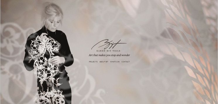
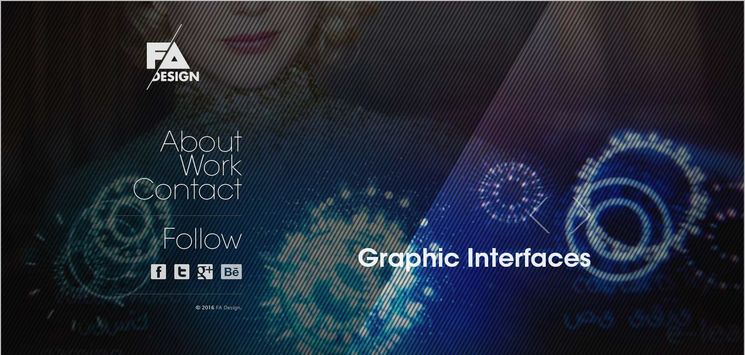
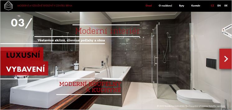
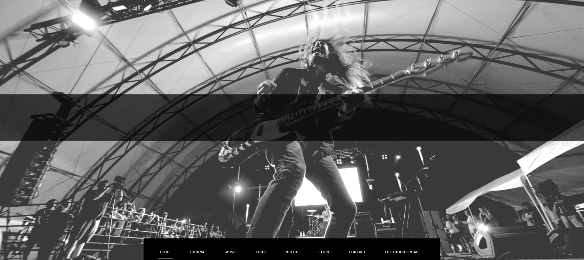
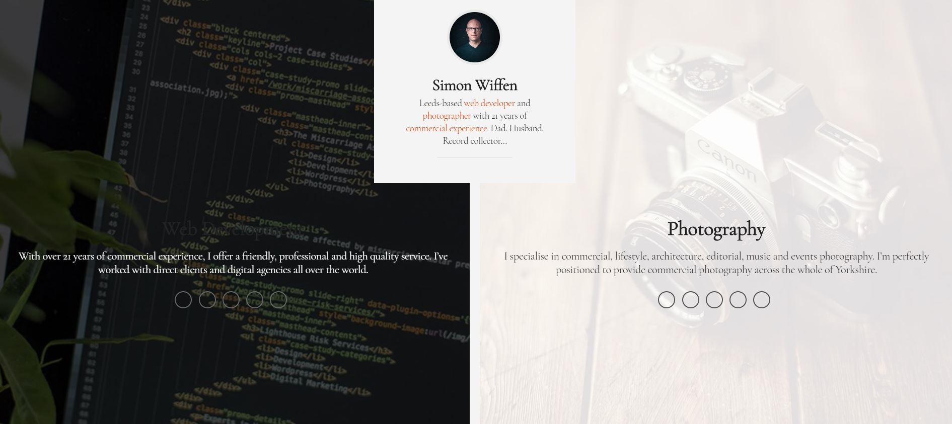
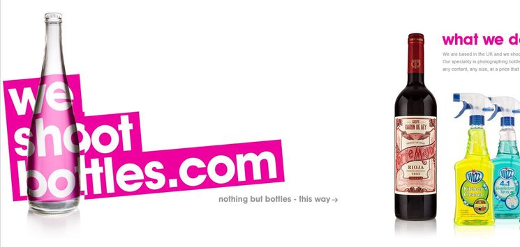
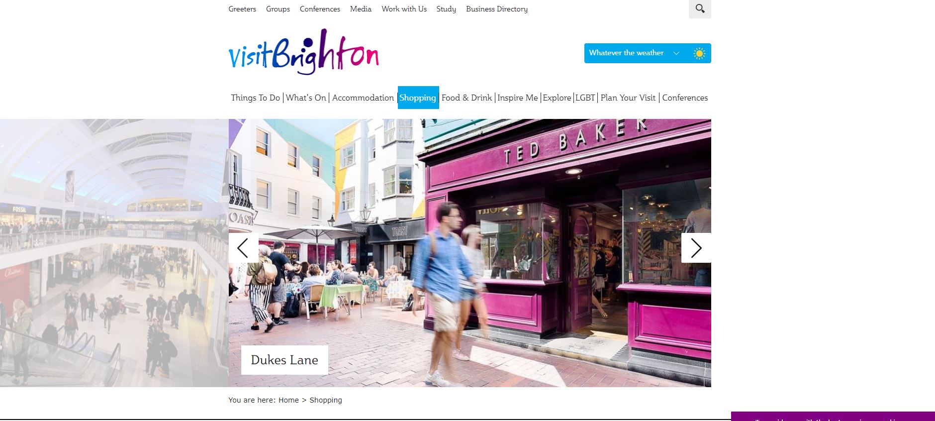
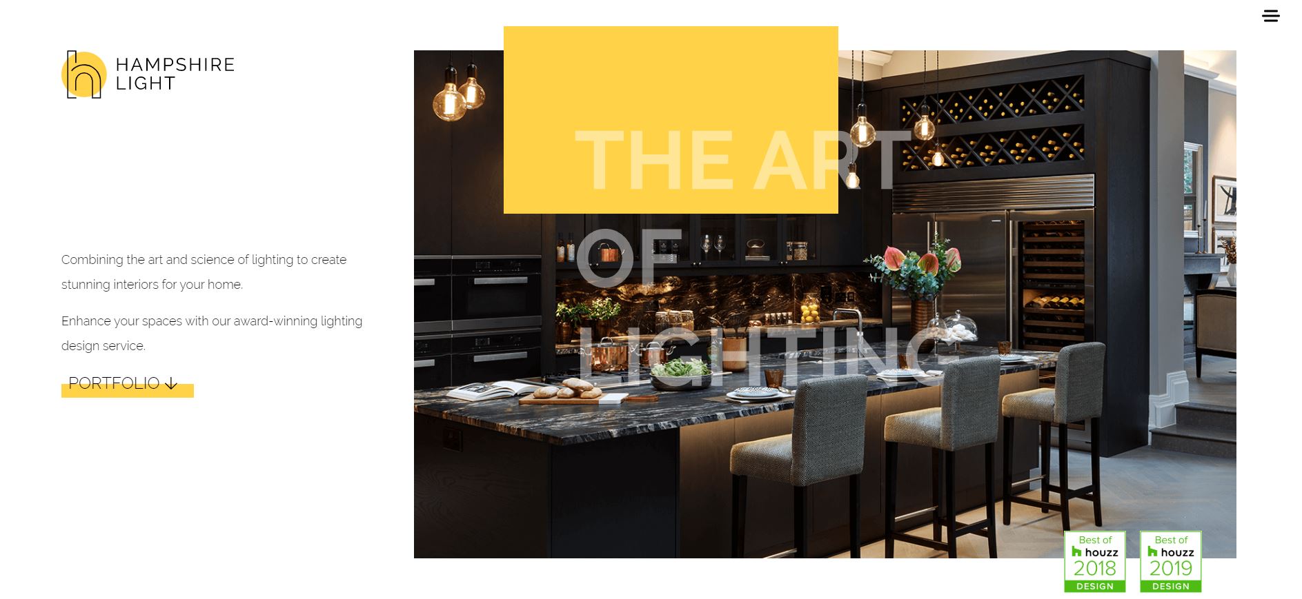
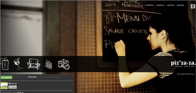
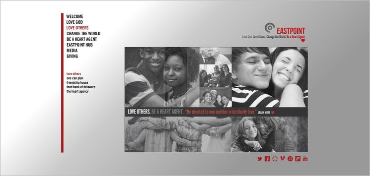
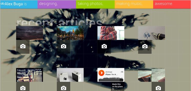
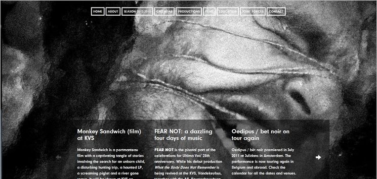
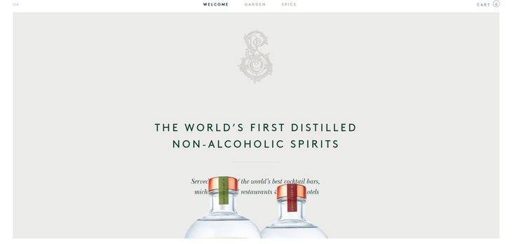
Transparency web design creates contrast, depth and adds a sense of realism to your design — specially when it is combined with an interesting background — without weighing things down. The overall effect will bring about an extra dimension an extra touch to a website. Transparency web design style has been a favorite trend for quite some time. Applying this web trend not only results in stunning visual effects, but can add some extra functionality to a design as well. When properly executed, Transparency effect makes some texts/objects pop off a background and stand out from the rest. This feature can be efficiently utilized to present a company, either by a logo or a message.
How Transparency technique is Applied?
Transparency effect is achieved through applying overlay techniques and variations in opacity. This style preserves the part of the image below the text so that the full image can still be seen to some extent. Transparency can be applied with varying degrees. Some designers utilize transparency throughout the design as a major element, while others apply it subtly only in selected areas. Employ different levels of transparency in different sections of a layout is an effective tool to make text more readable when placed above images. The designers often prefer to apply this approach to sliders when a description needs to be neatly presented. Regardless of its location and degree of application, the fact of matter is that transparency is used together with another design style. As I see it, it is impossible to have a detailed plan for a design structure by merely having transparency element in mind.
This is the Place


