Image Navigation Web Design Trend
Analysis & Showcase
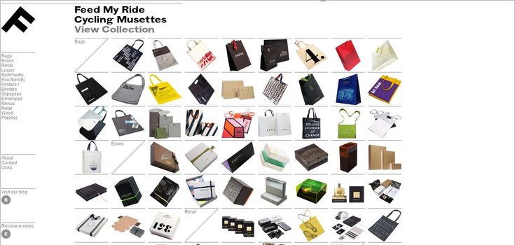
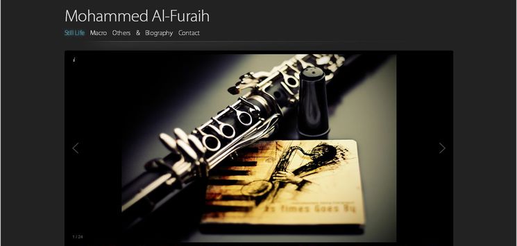
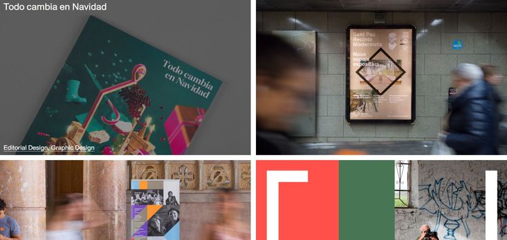
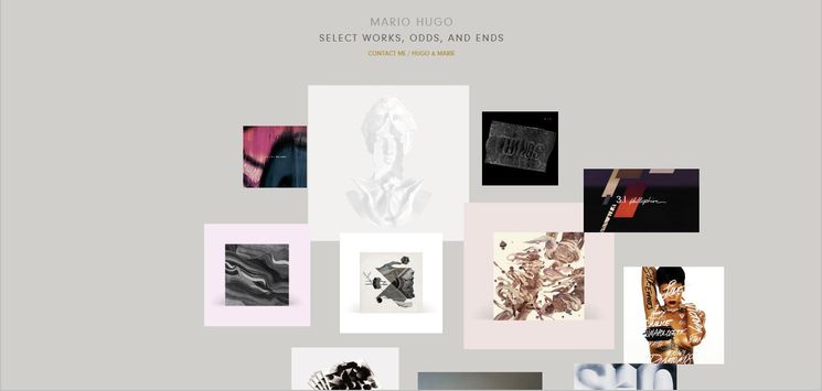
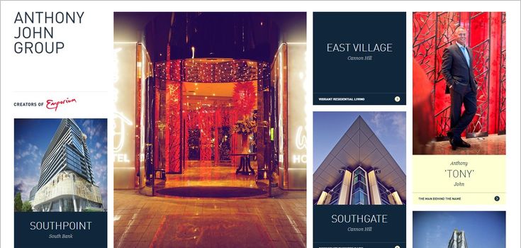
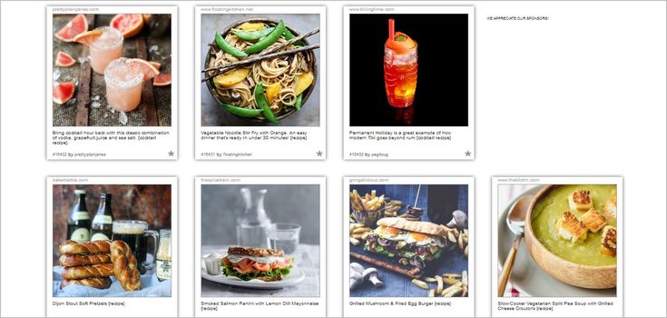
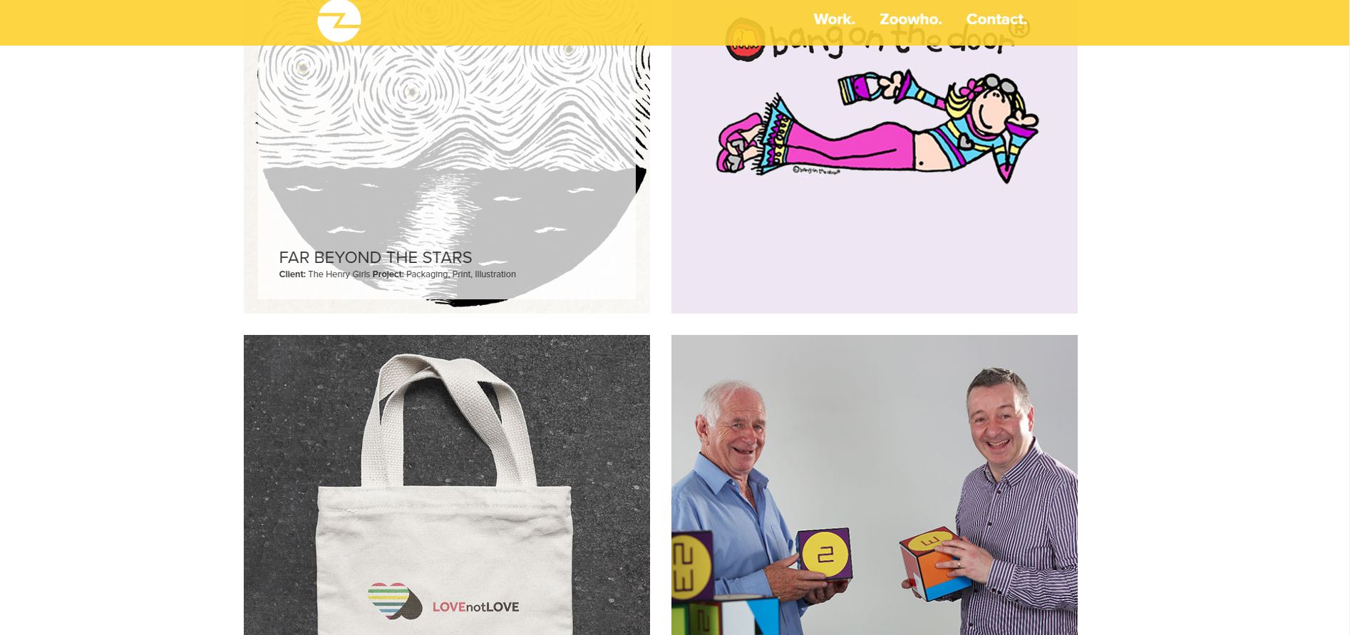
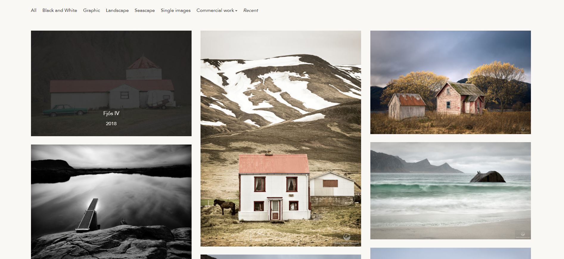
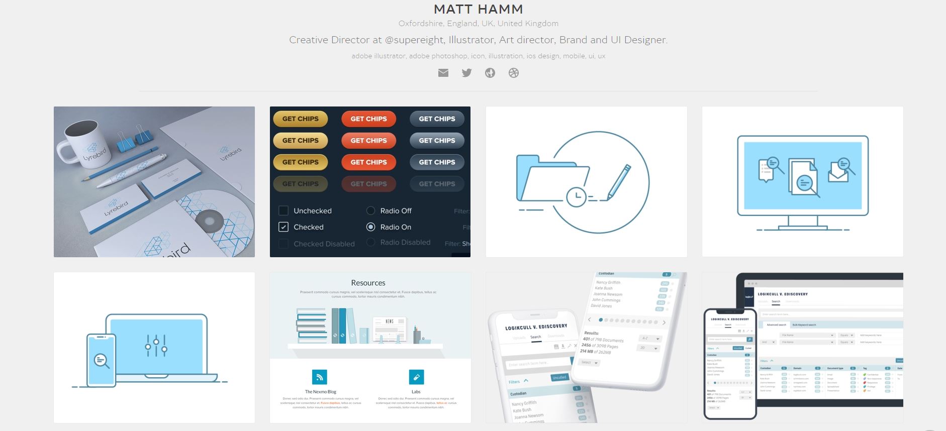
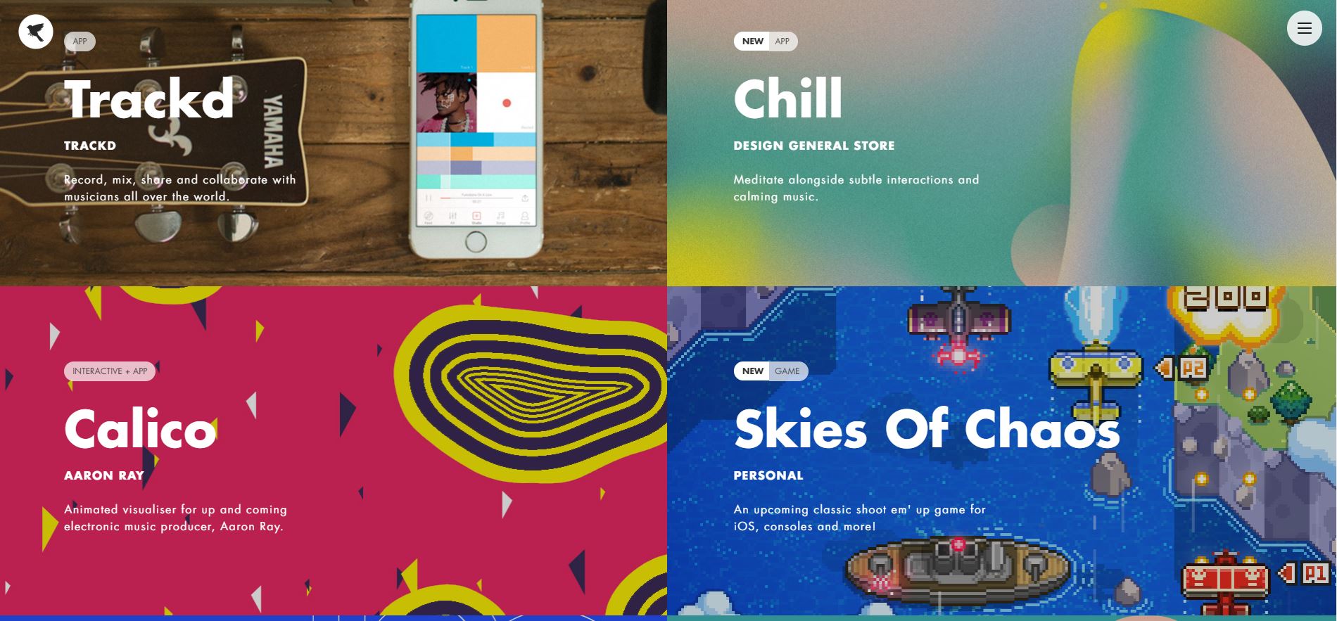
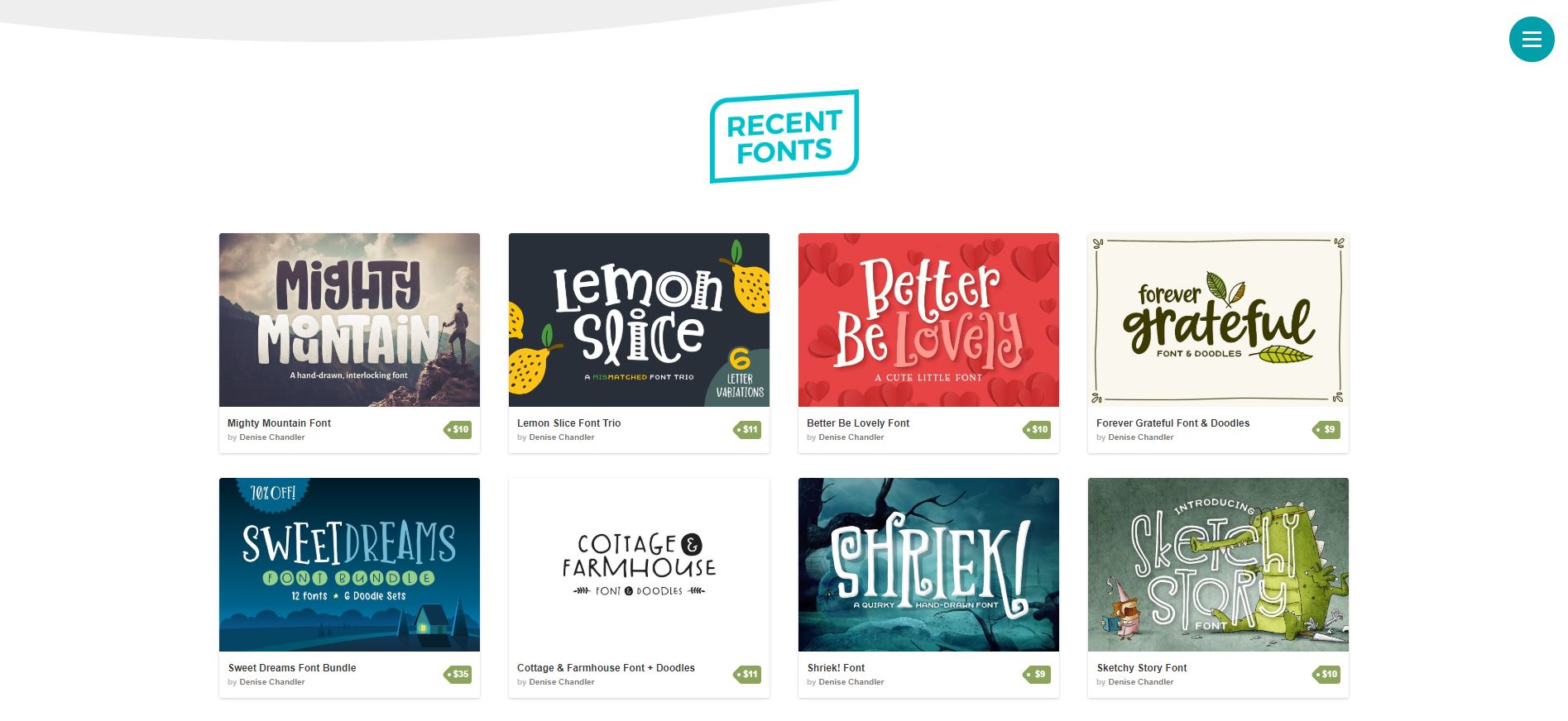
An effective navigation is one of the main cornerstones of every successful website. It means that besides being visually interesting, a good navigation has to address usability as well. In this respect, Image Navigation style is a relatively new trend gaining popularity. By applying this design style, the standard navigation menu is mainly or partly substituted by images that cover a good bit of a site page. These layouts use usually 3-4 text menu items in order to classify the subject into main categories under which the related images come. The detail information about each image would be revealed through hover and other mouse effects by users.
Pros & cons of image navigation design style
This trend is a favorite choice among the sites that will mainly present their numerous artworks/products directly and at the first glans. By limiting typical text contents on the first page, the designer utilizes extra space to fill with relevant photos or symbolic images. That being said, there is an important issue with these kinds of layouts. These sites are relatively less SEO friendly. If images are not provided with relevant descriptions in text, web spiders are not able to find them. Even when the proper description is provided, some browsers cannot help users to search it on the page site.


