Parallax Scrolling Effect in Web Design
Analysis & Showcase
What is Parallax web design?
Parallax style in web design is a scrolling feature that enables elements of a web page to move at varying speeds when the user scrolls. The intention is to break up the linear monotony of a website and to create the illusion of depth. The effect is particularly observed when the background of a web page moves at a different speed from the rest of the components when you scroll. Parallax web style has been around for quite some time now. It is in recent years, however, that it has become an increasingly popular trend and has taken the web design world by storm. Parallax effects are made possible through JavaScript, but pure CSS can also be used to achieve the same effect. In fact, pure CSS parallax is consistently becoming the method of choice for incorporating the technique into web design.
is Parallax a new technique?
The term parallax comes originally from the Greek word parallaxis which means alteration. According to Wikipedia it is: “a displacement or difference in the apparent position of an object viewed along two different lines of sight”. Although parallax is relatively new in web design, it is not a new concept at all. This technique has been around for many years and the concept can be observed in different sections of science such as physics, astronomy and psychology. For centuries, it has been utilized by ocean navigators and astronomers in order to compute distances and directions. Even in entertainment branch, the parallax effect is an old technique. It can be traced back to classic media in 1940s when it was first used for animation. Back then, background images moved slower than foreground objects in order to create a sense of depth (a faux 3D spin effect) in an otherwise 2D game. Since 1980s, it has been utilized in video games.
how Parallax effect is created in web?
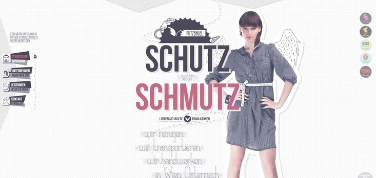
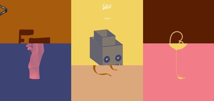
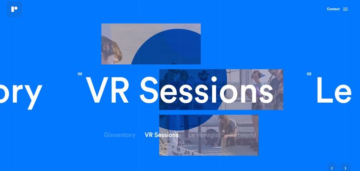
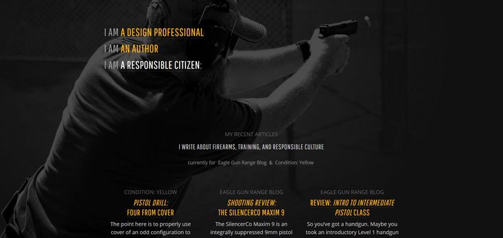
The parallax effect is attained by creating a perspective shift in the way an observer views an object. It is done through moving multiple backgrounds, hence having various objects scroll along different site lines at different speeds. In its true meaning, incorporation of parallax scrolling is not just a matter of adding cool effects to a website. From a functional point of view, there is more to it. It deals with usability of a website; it is basically utilized in order to create a visual curiosity which intrigues a user’s interaction. When you look at a screenshot image of a site having parallax effect, it can be interpreted as any other web style depending on the graphic layout applied. In this regard, it can be argued that parallax technique is not a stand-alone web style. However, it is considered as such a one. Once you visit such a website and then interact through scrolling, a different world of design layout would be revealed. So in this respect, Parallax style is very unique.
what are pros of Parallax Scrolling web Design?
The degree of applying parallax technique varies. In some layouts it has been utilized more prominently while in others integrated subtly as a compliment to the overall design only. This design style is usually seen on one-page websites. Nowadays, there is much more creativity and variation in applying Parallax style. Nike, Inc. was one of the pioneers that utilized this technique on its website. When implemented properly, Parallax design style creates stunning visual effects. They are visually appealing web pages that users enjoy browsing. The following is a list of its advantages:
- On the whole, increases the visual appeal of website pages.
- Catches visitors’ attention in a powerful way, hence extends visitor engagement on the site.
- Effectively guides your visitors through the different parts of the site.
- Improves user experience through enhanced visual interactivity.
what are cons of Parallax Scrolling web Design?
Nevertheless, there are (like many things in web design) potential downsides to using Parallax design style. The following points are considered as possible disadvantages:
- When implemented on a single page website, the site’s SEO will be definitely suffered. You can only have one set of meta information and mainly one URL to use for SEO.
- If not appropriately incorporated, parallax can cause issues for a website. Among other possible drawbacks, the site’s loading time will most probably be slowed.
- It is difficult, and some times impossible, to utilize this technique in mobile design.
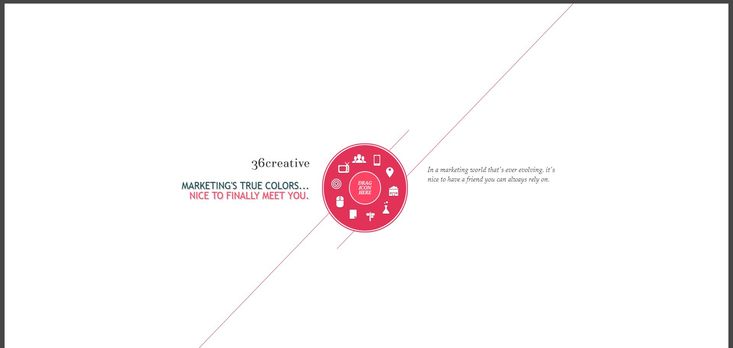
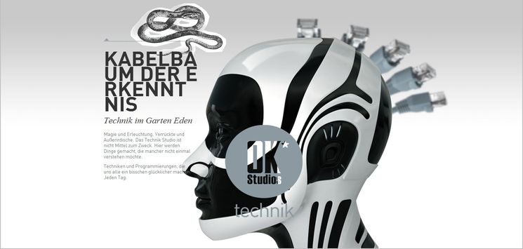
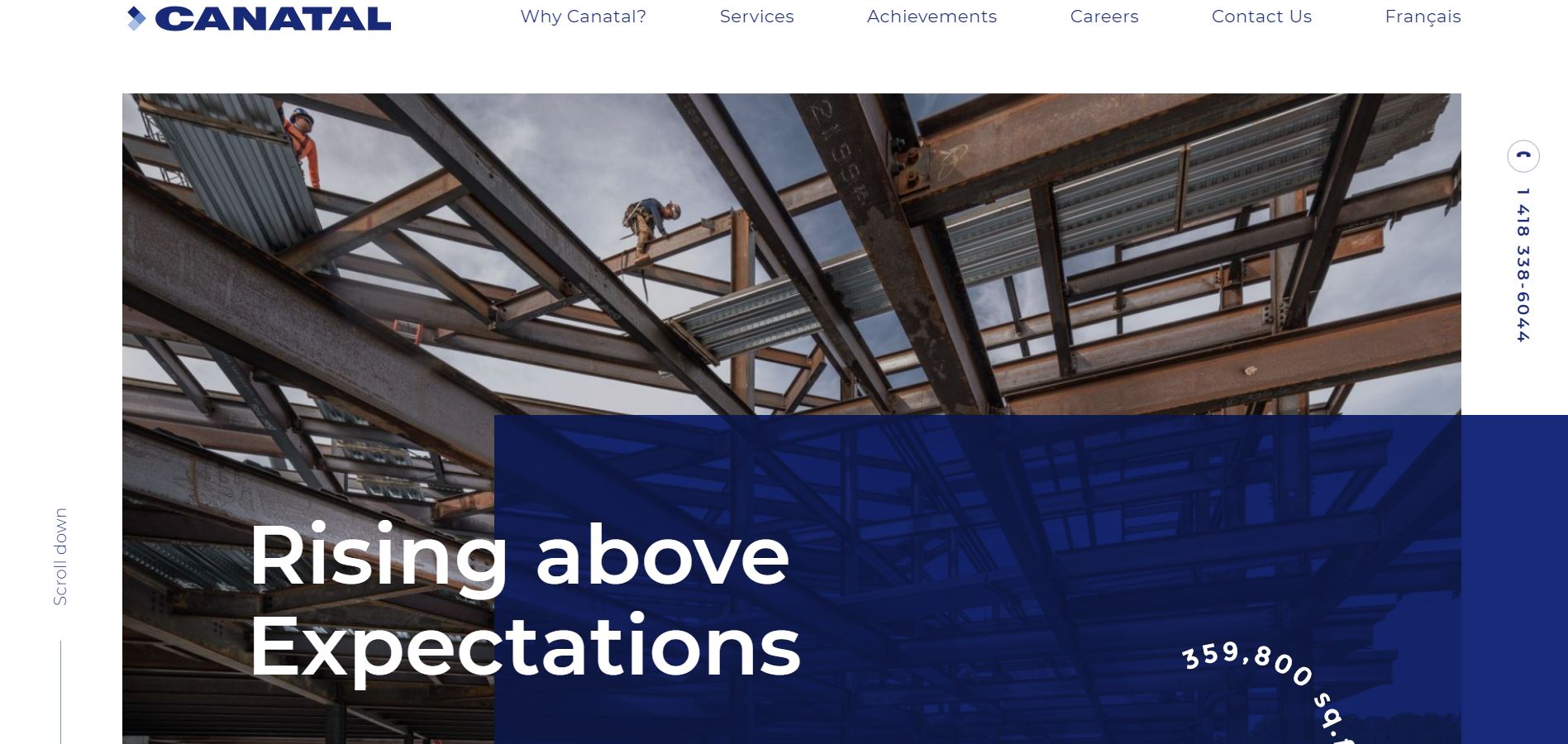
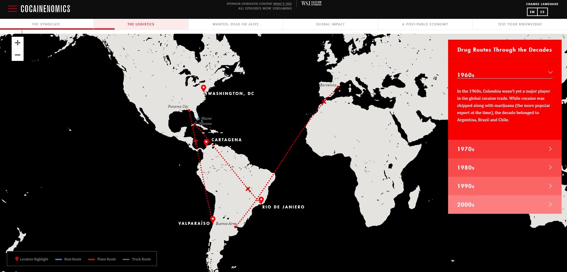
NOTE: Sites using Parallax scrolling effect usually take longer to load. So please have the patience with following websites.

