Watercolor Effects in Web Design
Analysis & Showcase
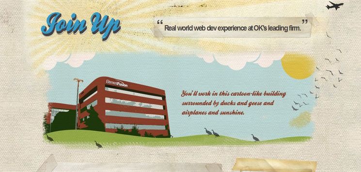
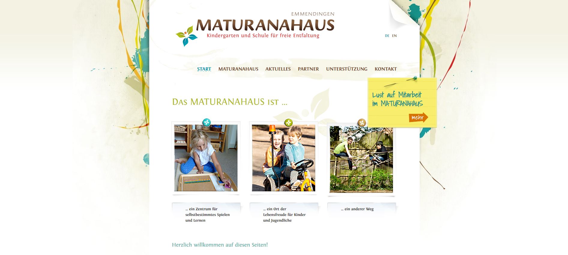
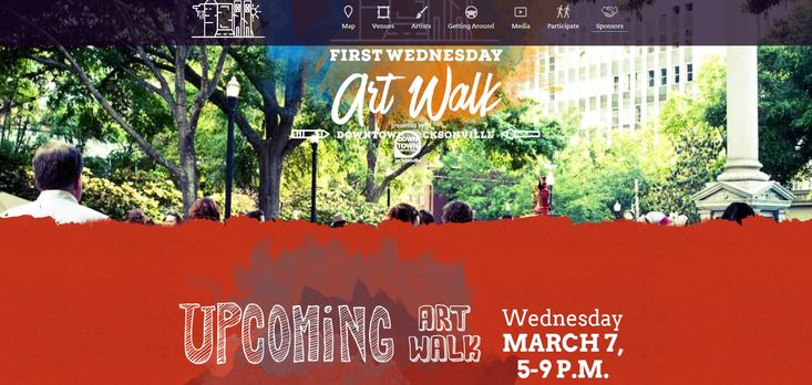
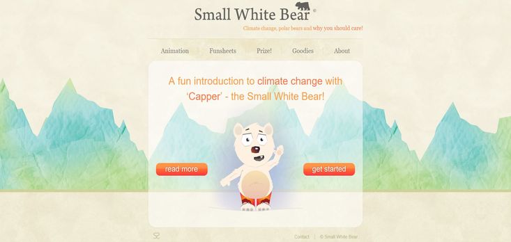
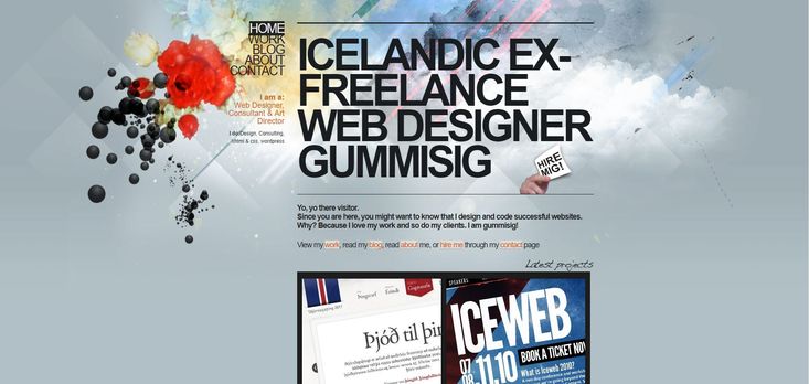
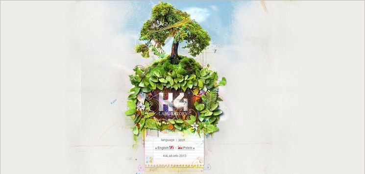
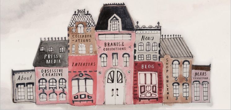
By utilizing a computer technique called digital watercolor, web designers create a full design that looks painted. It is an effective, elegant way to make a design look very exclusive. Therefore, for designers who are looking for cool visual effects, Watercolor Effects style has become a favorite choice. This design trend is fun, easy to apply and work with a variety of different types of content. Additionally, it is a nice option to emphasize the content.
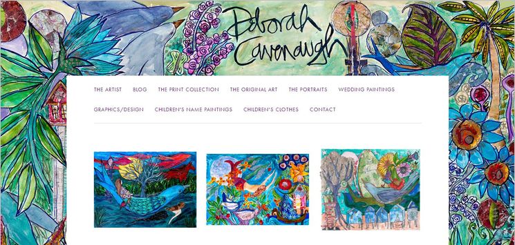
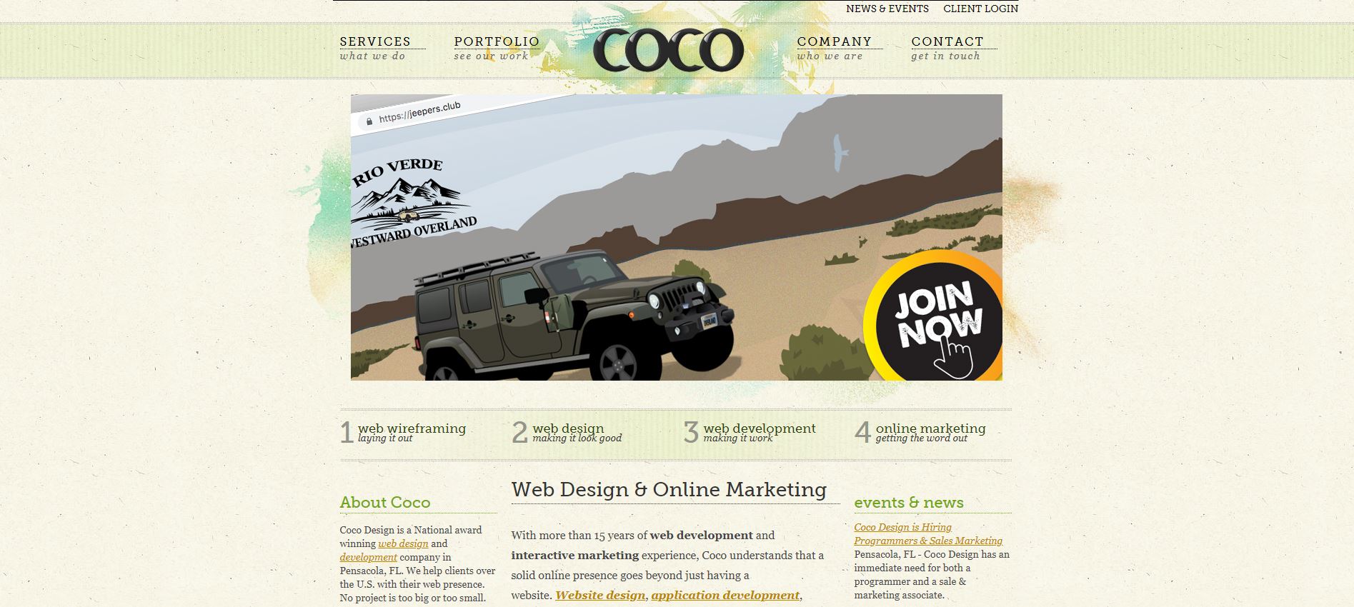
Watercolor art has been around for more than a century. In web design, it has been used for years now. So, using of this art is no longer exclusively limited for the canvas and paper. Furthermore, with the availability of watercolor Photoshop elements nowadays, it has become easier to create a layout look that is very close to a traditional watercolor painting. Watercolor elements and brush strokes can be used in web design in different ways and in differing degrees. It is a wide range. At one end, they can be used as a focal point which stands out in the layout. At the other, they can be applied subtly, resulting in a subdued look which stays in the background.
Watercolor effects are mostly used as backgrounds. In addition, this technique can be applied to complement/enhance another design style like Abstract or Grunge. As I mentioned in our discussion about Illustrated style, I have classified the web designs predominantly composed of watercolor motifs under a separate category. The amazing visual look of these designs, which is achieved through using mellow pastel colors and gentle strokes, makes them well-deserved to be treated under their own class. Like the other illustrated elements, Watercolor Effects style is used mostly for artistic works or portfolio presentations. It is a great technique to give a layout an abstract look.
Publish Path
