Handwritten Typography Web Design
Analysis & Showcase
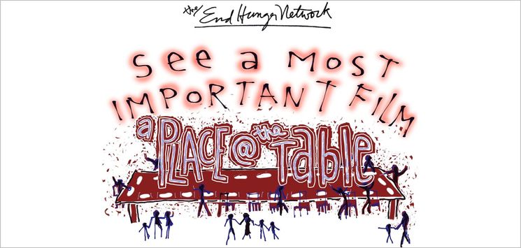
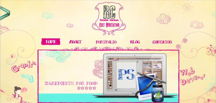
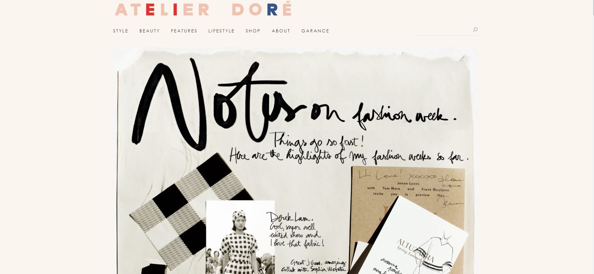
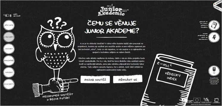
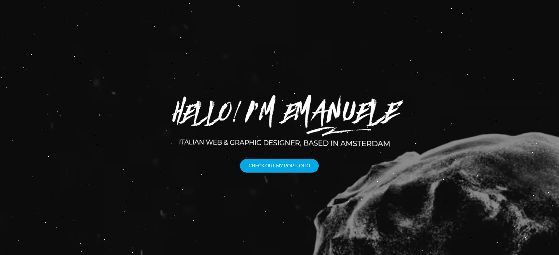
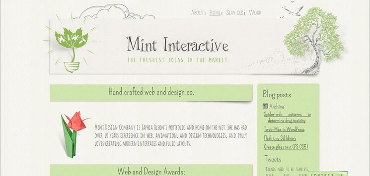
The intention of using Handwritten Typography style is to give a website a human touch — a more personal and an informal nature. Here we are dealing with a somehow different and unique member of the typography class. In our discussion of two other members of this design family (Typography and Big Typography), I considered them as stand-alone design embellishments. This is not the case for handwritten fonts; they cannot be utilized as the only design element to create a nice and successful web design. Handwritten typography should be combined with other elements of hand drawn technique such as pure typography, hand-made icons, fuzzy lines and especially sketchy or doodle-themed illustrations.
Handwritten Typography style has been a favorite trend for web designers for a while now. It is an interesting design style that evokes users’ curiosity and engagement. However, it has several flaws. Firstly, there might be a readability issue that eventually leads to miscommunication; users might encounter some problems in finding the information they are searching for. Secondly, if it is overdone, the design becomes monotone and boring. Therefore, inclusion of other design elements is needed. Since handwritten is an illustration-driven technique, the presence of at least sketchy illustrations seems essential. This combination makes the design to stand out and keep the viewers engaged in a website.
Because of its ability to convey creativity and uniqueness and hence a touch of personality, Handwritten Typography trend is mostly used in Grunge design style and especially in portfolio websites. Additionally, it has recently become a favorite choice for those businesses that are looking at every possible alternative to make their brands stand out. There are also some websites related to art or entertainment activities that utilize this style. They want to create a fun and relaxed atmosphere in order to further stimulate visitors' curiosity and engagement. Although using of comic fonts like Comic Sans are not generally recommended as an effective choice for text content, they can be useful in the above case. Obviously, such fonts should be used sporadically only and not to be exaggerated. Otherwise, they can do more harm than good.
Jacquico

Sprout Box


