Breaking The Grid In Web Design
Analysis & Showcase
what are asymmetrical and broken grid layouts?
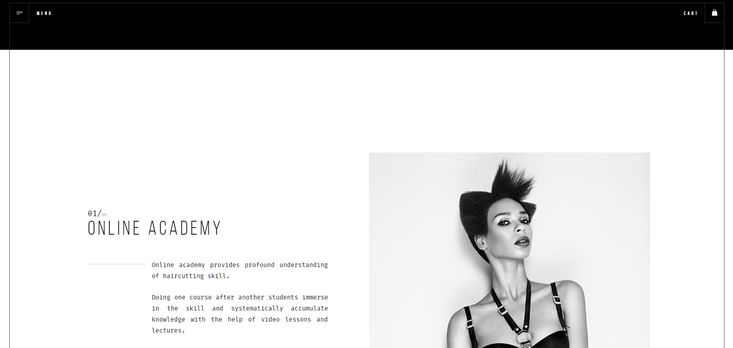
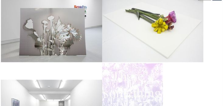
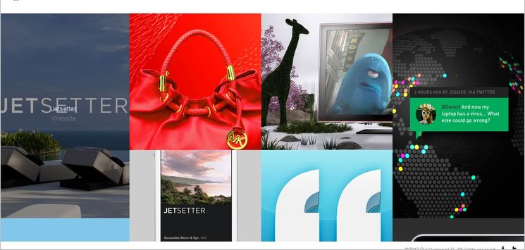
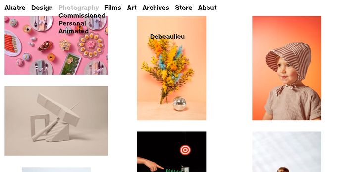
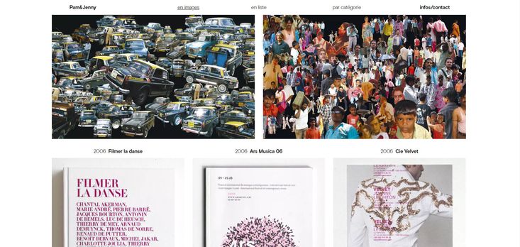
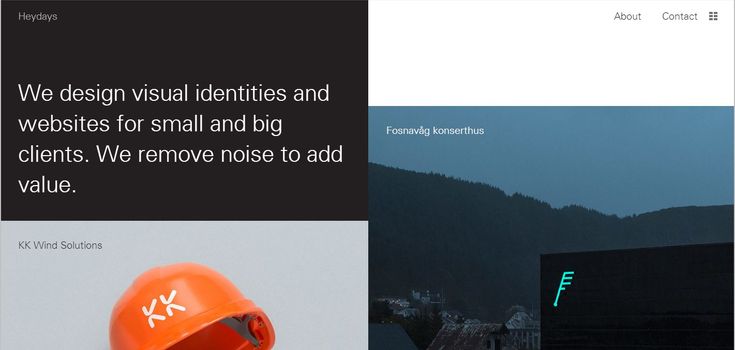
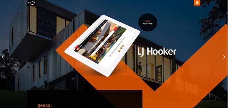
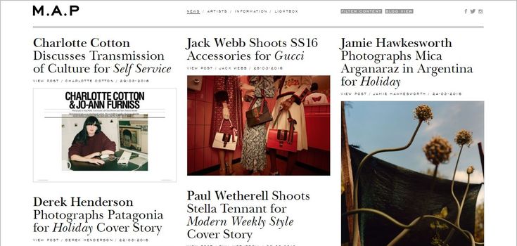
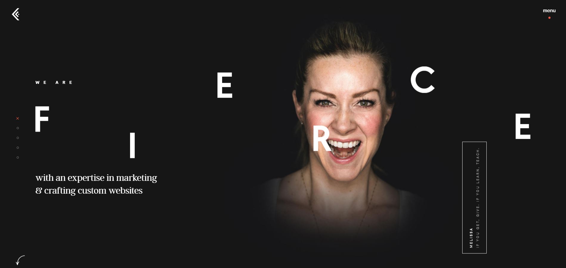
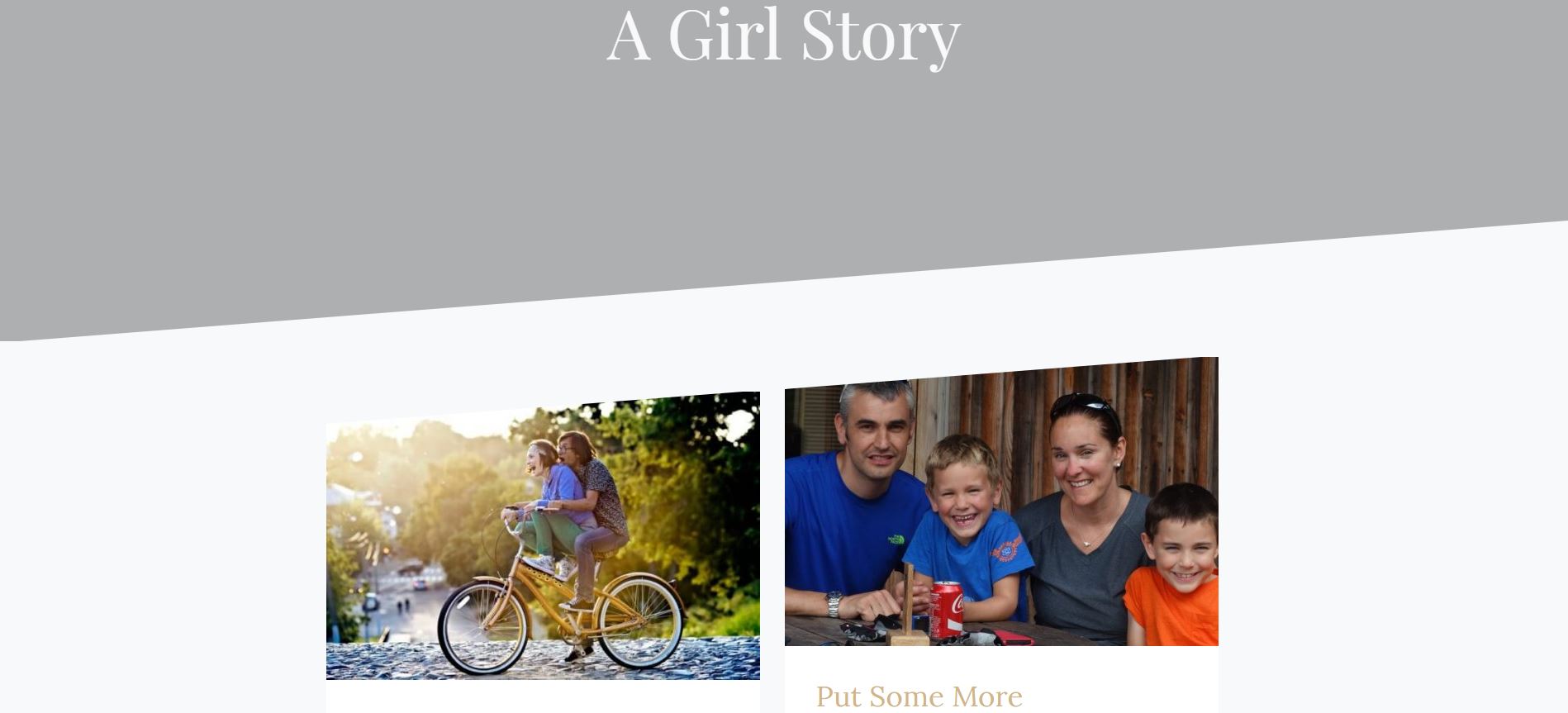
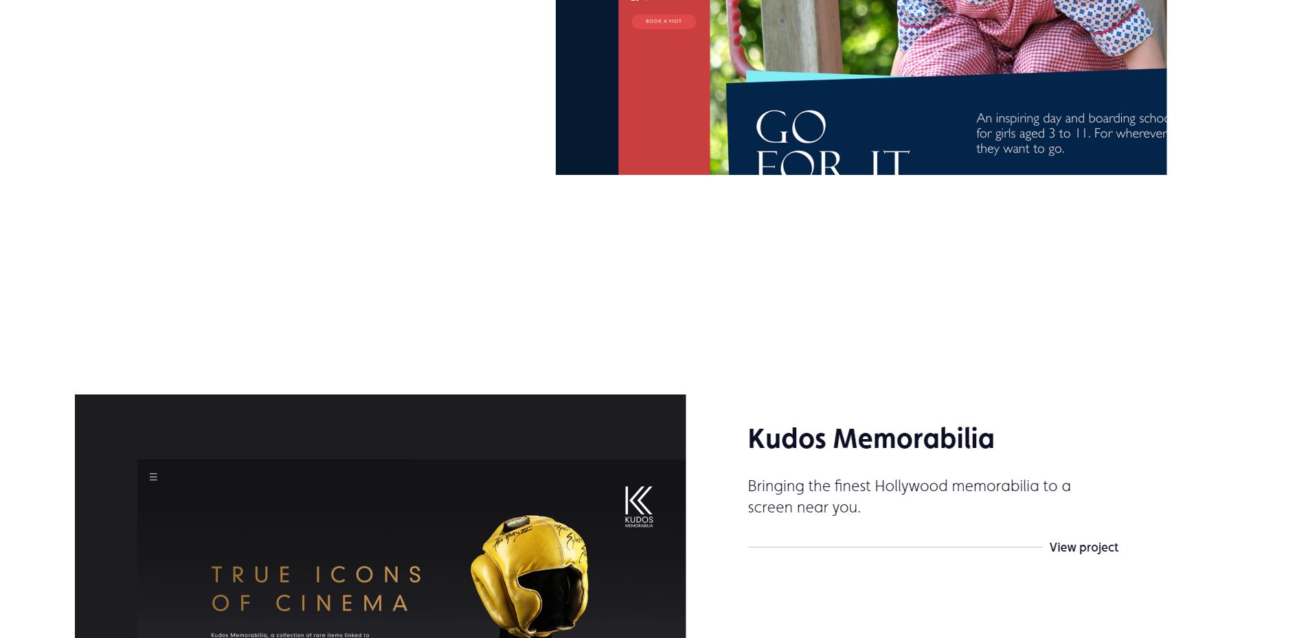
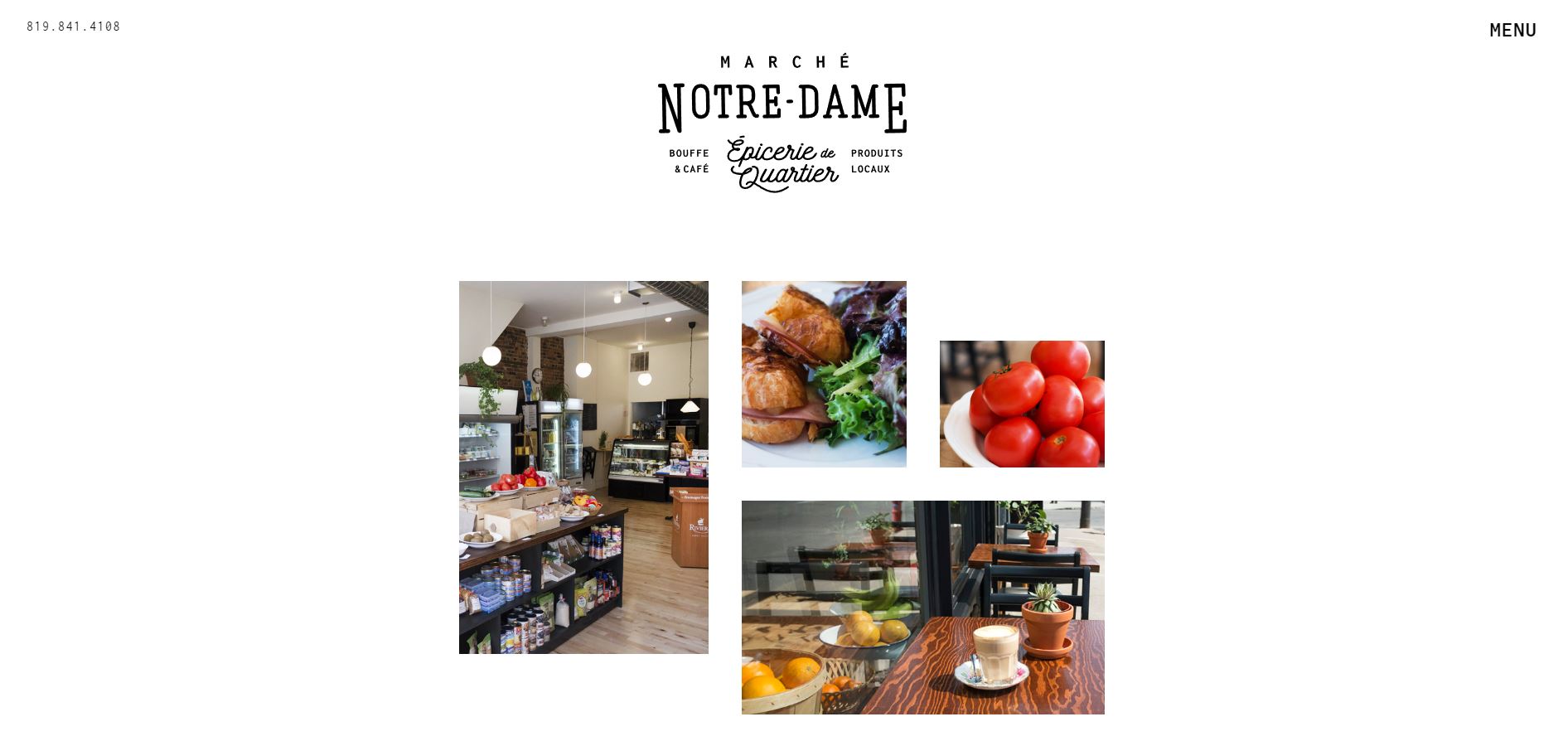
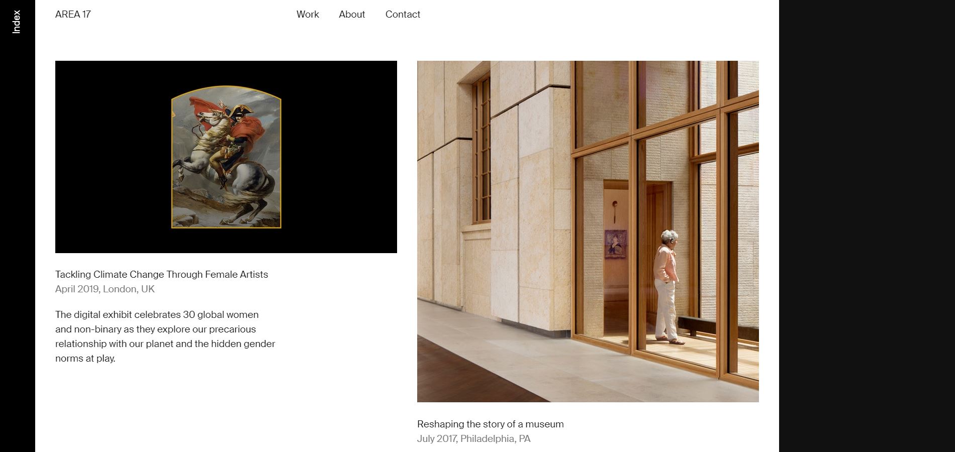
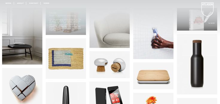
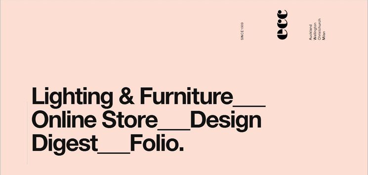
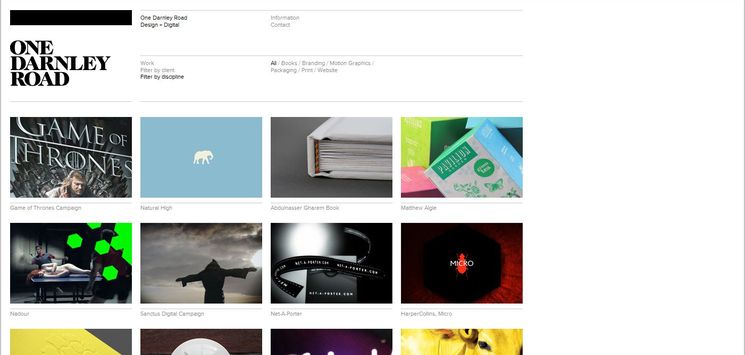
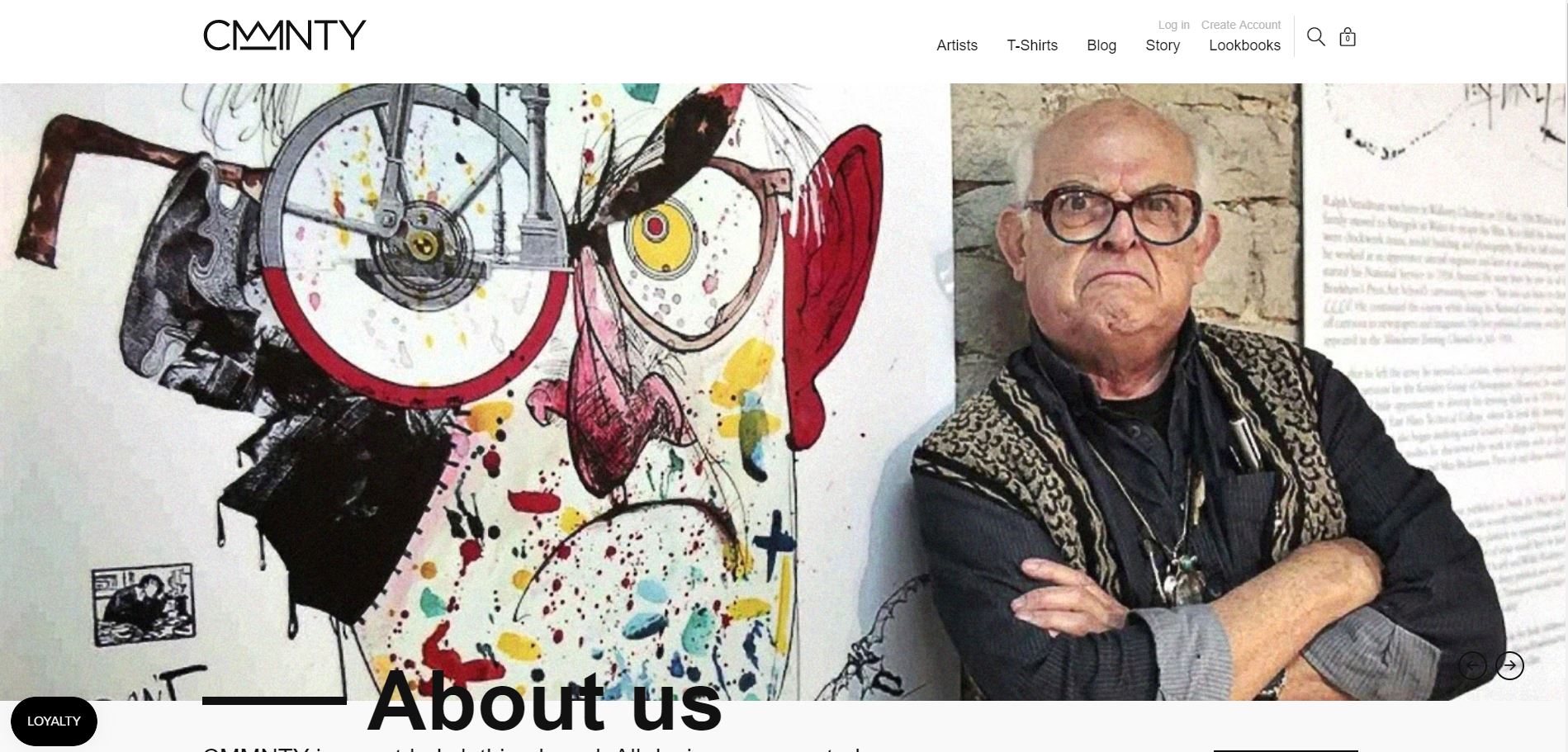
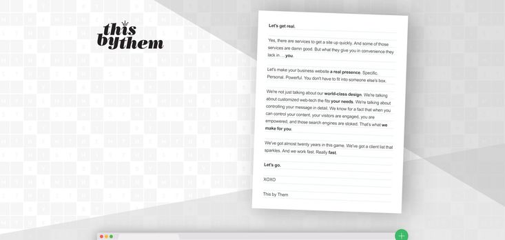
In Broken-grid design, the main goal is to achieve creativity and innovation by applying asymmetrical positioning of text, overlapping images, and irregular shapes. What we said in great detail about advantages of Grid-based design is obviously applicable to Broken-grid as well. In addition, it overcomes the disadvantages that are pertinent to a standard Grid-based layout. Regarding the drawbacks of using the latter, our options of bringing about fantasy and flexibility to a design are limited. It is due to some rigid guidelines upon which Grid-based technique is constructed. That is the main reason why the idea of Broken Grid design was born, hence utilizing an asymmetrical layout as an effective toll.
How to set up a Broken Grid layout?
To construct a Broken Grid design, first a solid grid system has to be established in order to be able to break out of it effectively. Then broken grids are achieved by using certain uncommon positioning patterns in the grid system to generate an asymmetrical layout. The process is completed by repeating irregular patterns, mixing and matching both symmetrical and asymmetrical design elements. In this procedure, layering has a vital role. It is achieved by means of layering textures, typography, images, illustrations, colors and white (negative) spaces. Layering elements give a design a dynamic look and brings on a perception of separation and depth to a web page. It creates a sort of offset balance by allowing you to move off the grid while maintaining unity in the design.
benefits of asymmetrical design layouts?
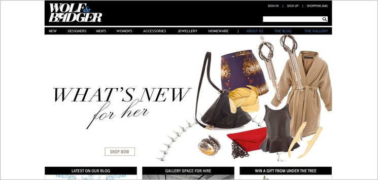
In this nsesign layout, the emphasis is on creative and out-of-box utilization of extra elements. Breaking out of a grid can introduce contrast, dynamism and curiosity into web designs. When users see a regular grid design, they come to understand that the page will include more or less the same kind of information. To avoid this shortcoming, applying broken grid or asymmetrical layout is a very handy tool. Furthermore, breaking grid layout is an alluring and efficient way to grab users’ attention — which is always a main part of the functionality of a web design strategy. This necessity becomes even more important when we are creating websites for commercial purposes, like all types of businesses and online stores. In these cases, the major aim of a web designer/developer is to ensure that the website is capable of attracting people and then offering them a significant user experience that realizes their expectations.

