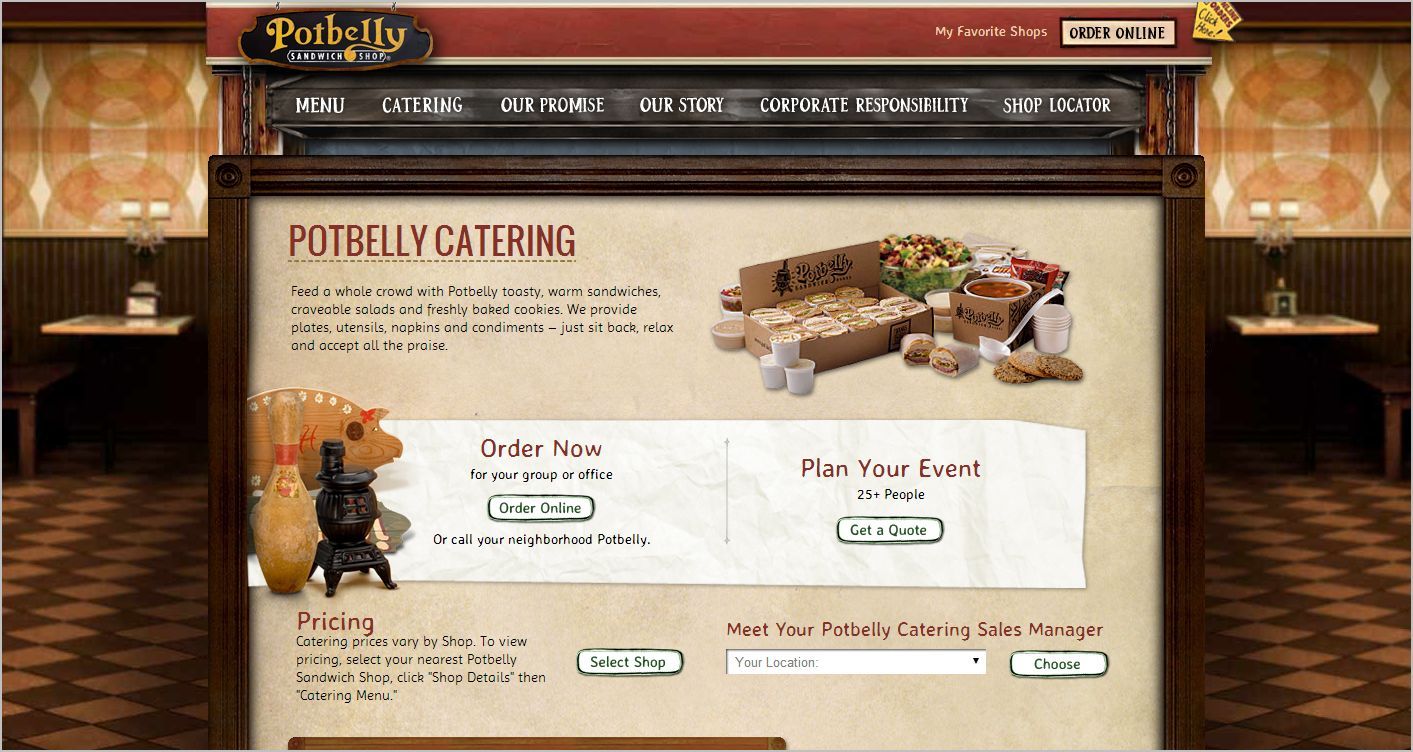
Photo-realistic Background Images
Analysis & Showcase
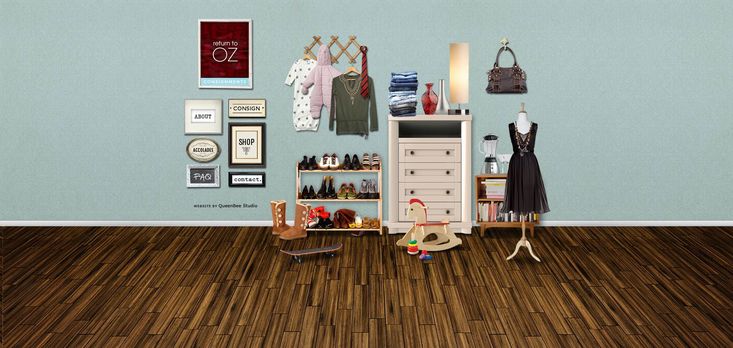
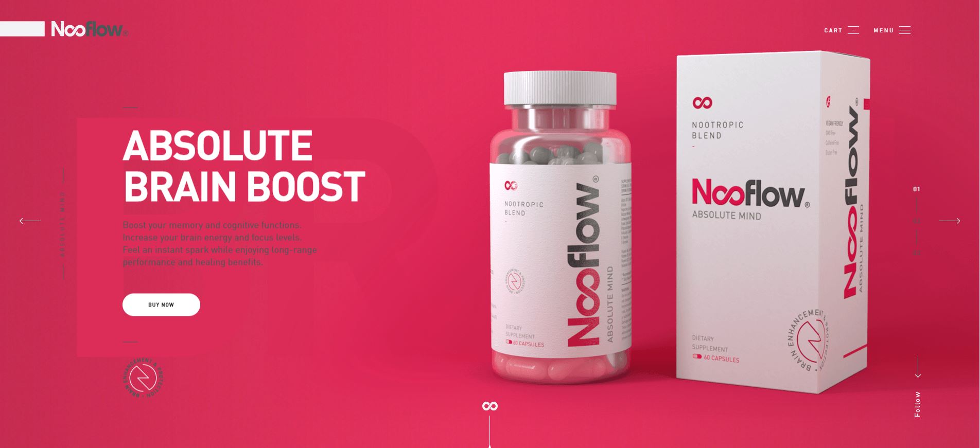
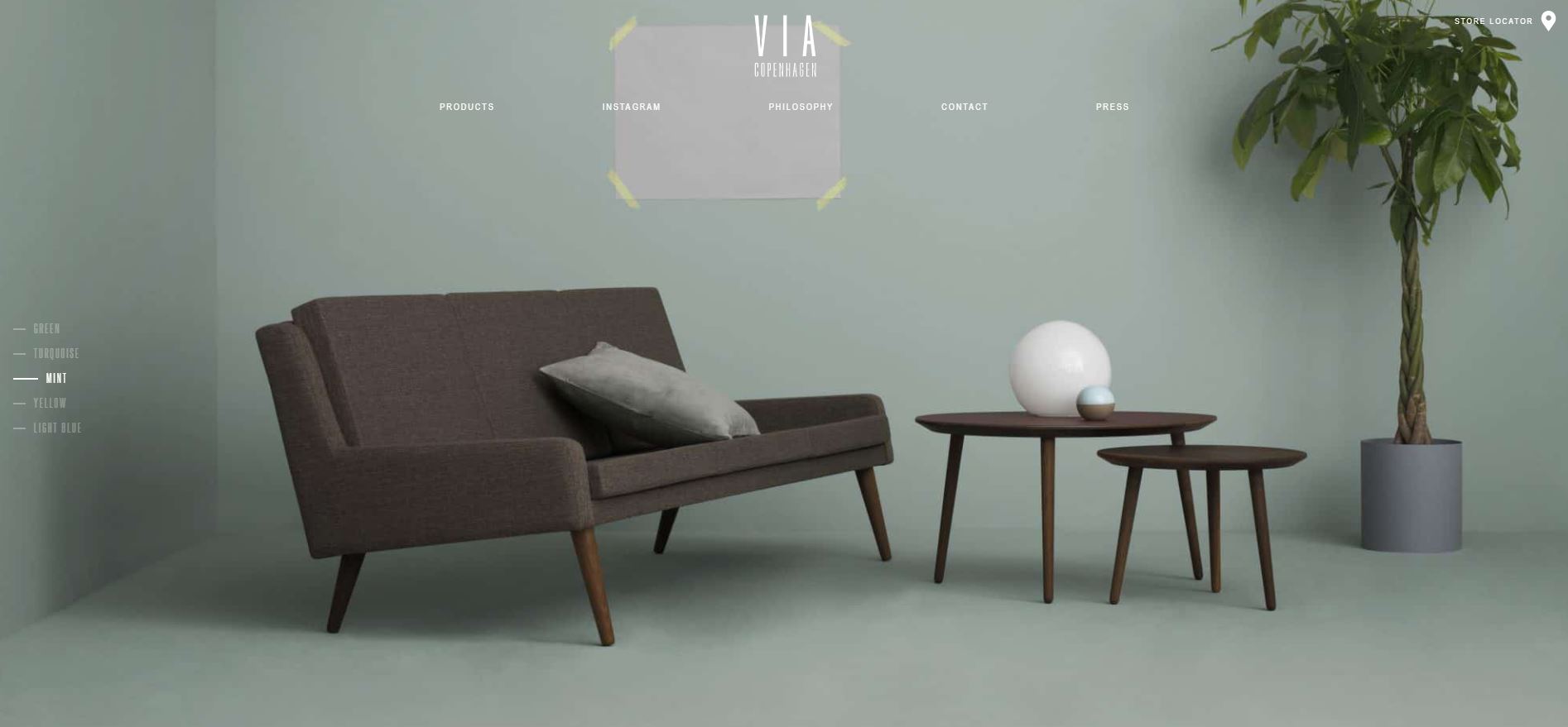
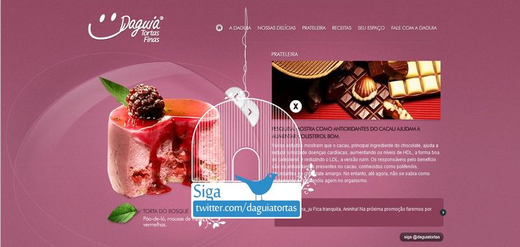
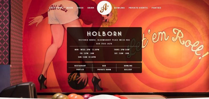
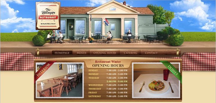
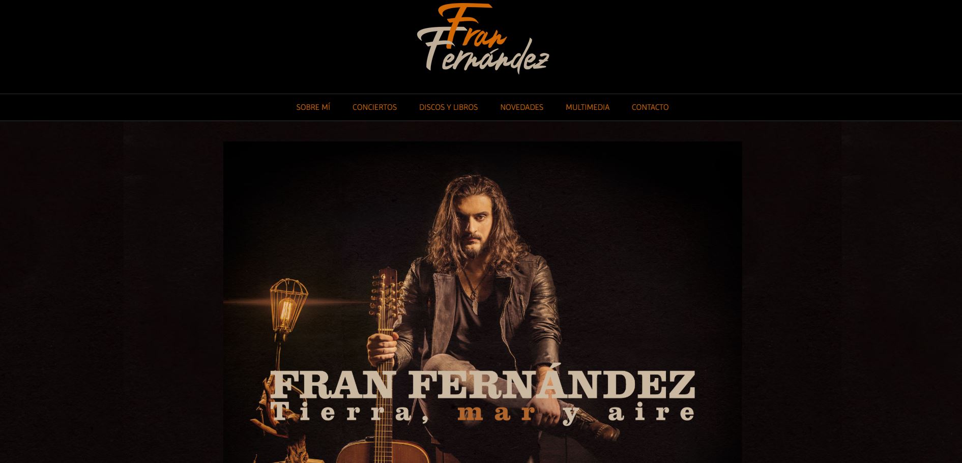
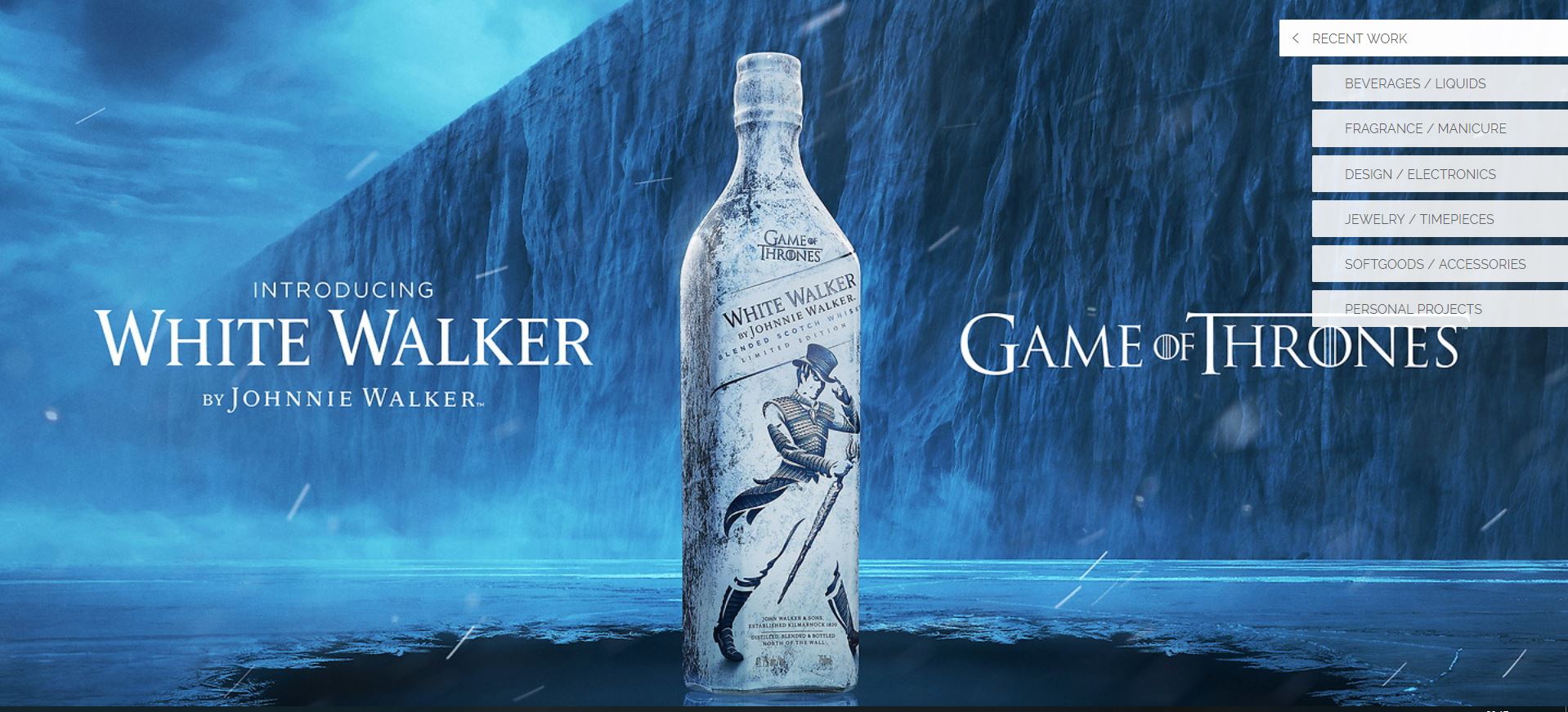
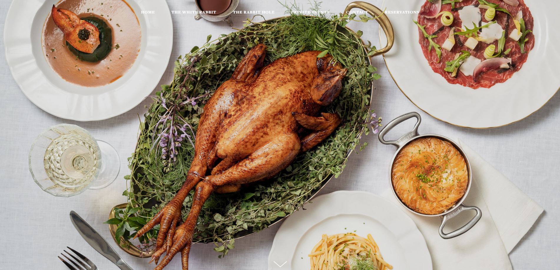
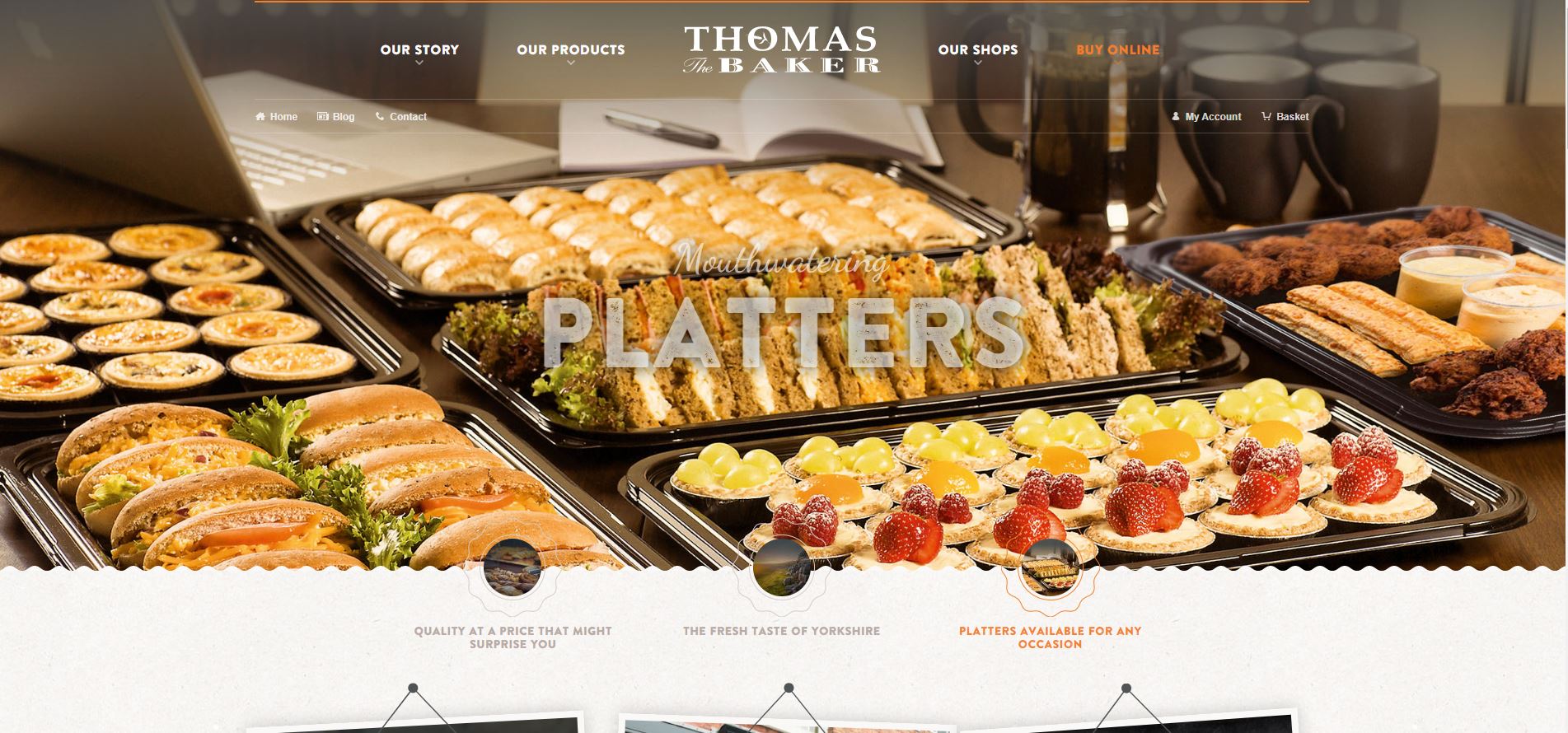
Utilizing photo-realism in web design is still a popular website trend. It is principally of the same reason that has made print-inspired (Typography) web design trend an appealing style in recent years. Their common factor is the intention to give the design a real look and feeling; to make it seem touchable. The designer wants to offer the visitors a composition including some real objects to look at. In this way, the design is experienced as something more connectable and real.
features of Realistic Websites
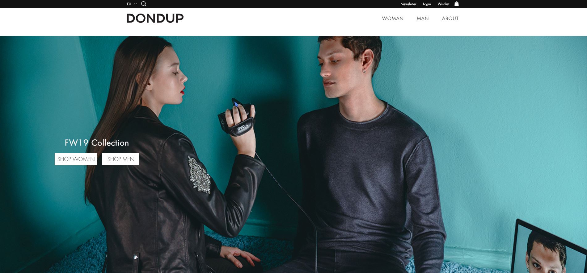
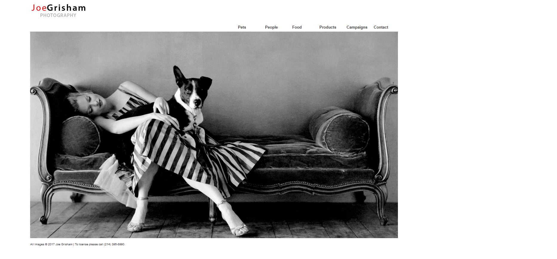
Having a background composed merely of some zoomed out real objects cannot necessarily set the scene for a thorough photo-realistic design look. For example, a distant image of a street or a park is not going to give the viewers a sense of photo-realistic experience. To achieve this objective, three prerequisites have to be met: close-up, association, and perspective. By close-up I mean that subjects of the design must be close-up images. It gives site visitors a feeling of closeness; as if she/he is sitting right there. The second condition, association, means that objects assembled in the design should be somehow related to each other . In this way, the overall image of selected items reflects a real instance of daily life. Finally, in a typical photo-realistic image, the items are photographed from an eye-catching angle in order to keep the viewers engaged in the scene. An interesting perspective attracts visitors' attention.
Photo-Realistic settings
In photo-realistic backgrounds, the choices in a selection field of items are numerous. All depends on the designer's imagination. To professionally set up an impressive scene and meet the above mentioned three essentials, images are usually built either out of multiple photographs or have elements (digital or computer-generated) added to photos that appear real. It is a tough technique to accomplish, because you need to make sure the shadows, light sources, etc. are all consistent. In short, it basically means selecting images in which a lot of attention has been paid to the details; an image that stand out from the background. One of the most popular backgrounds utilized in recent years — which is becoming somehow overused — is desktop setups. These setups (an assembly of various items like papers, books, pencils, paper clips, coffee cup, etc. on a wooden surface) can in most cases considered as Skeuomorphic Design Style as well. The other favorite background is nature-inspired setups. As mentioned earlier, the options are endless and there are still many other awesome setups to emerge in the near future.


