Grunge Web Design Style
Analysis & Showcase
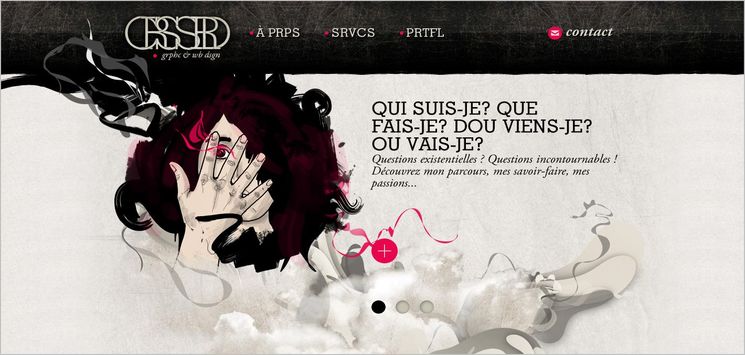
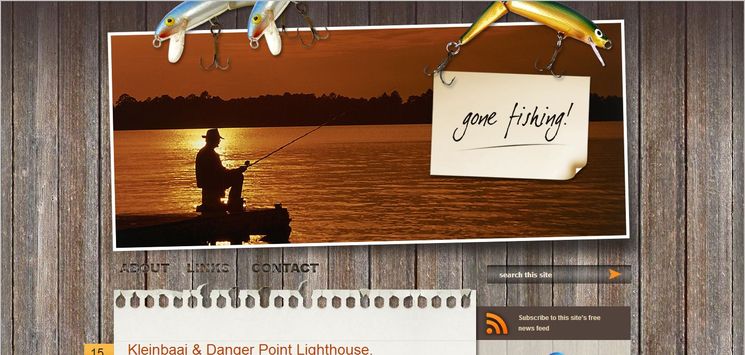
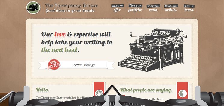
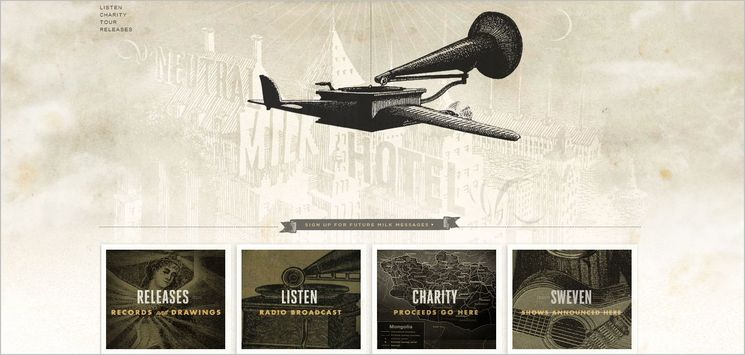
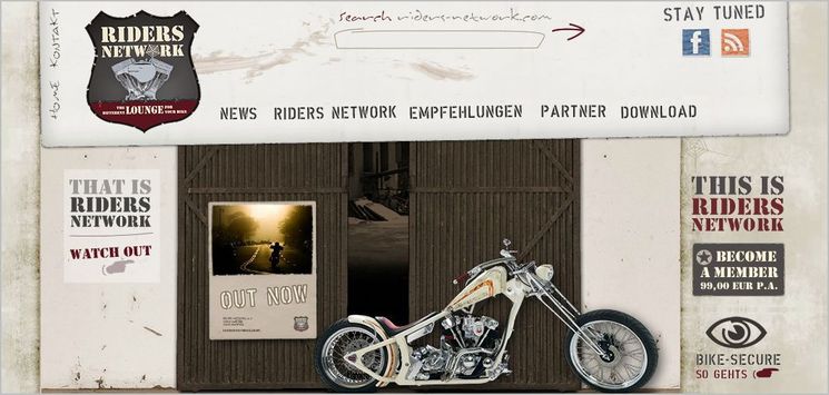
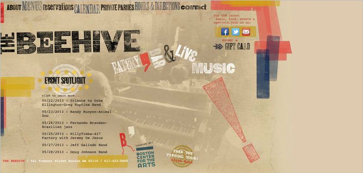
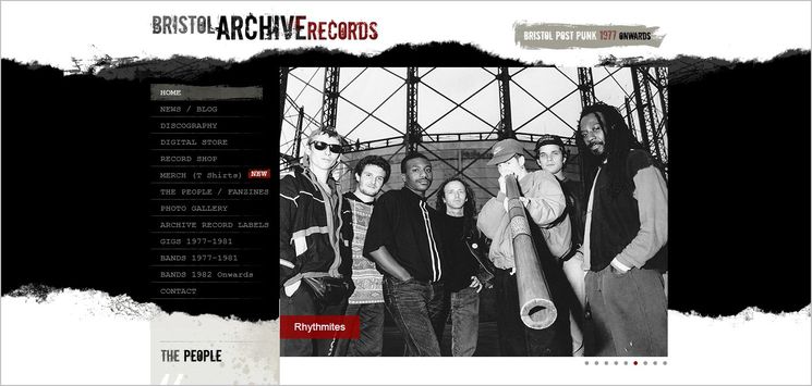
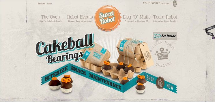
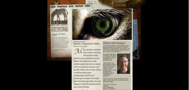
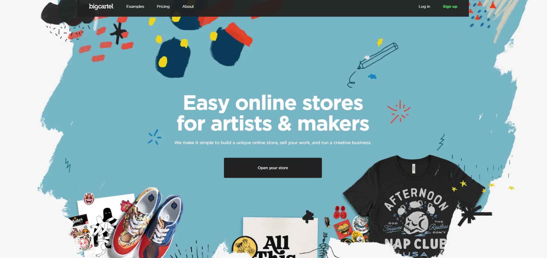
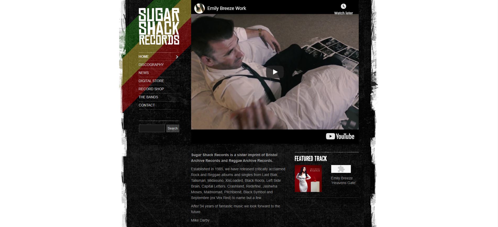
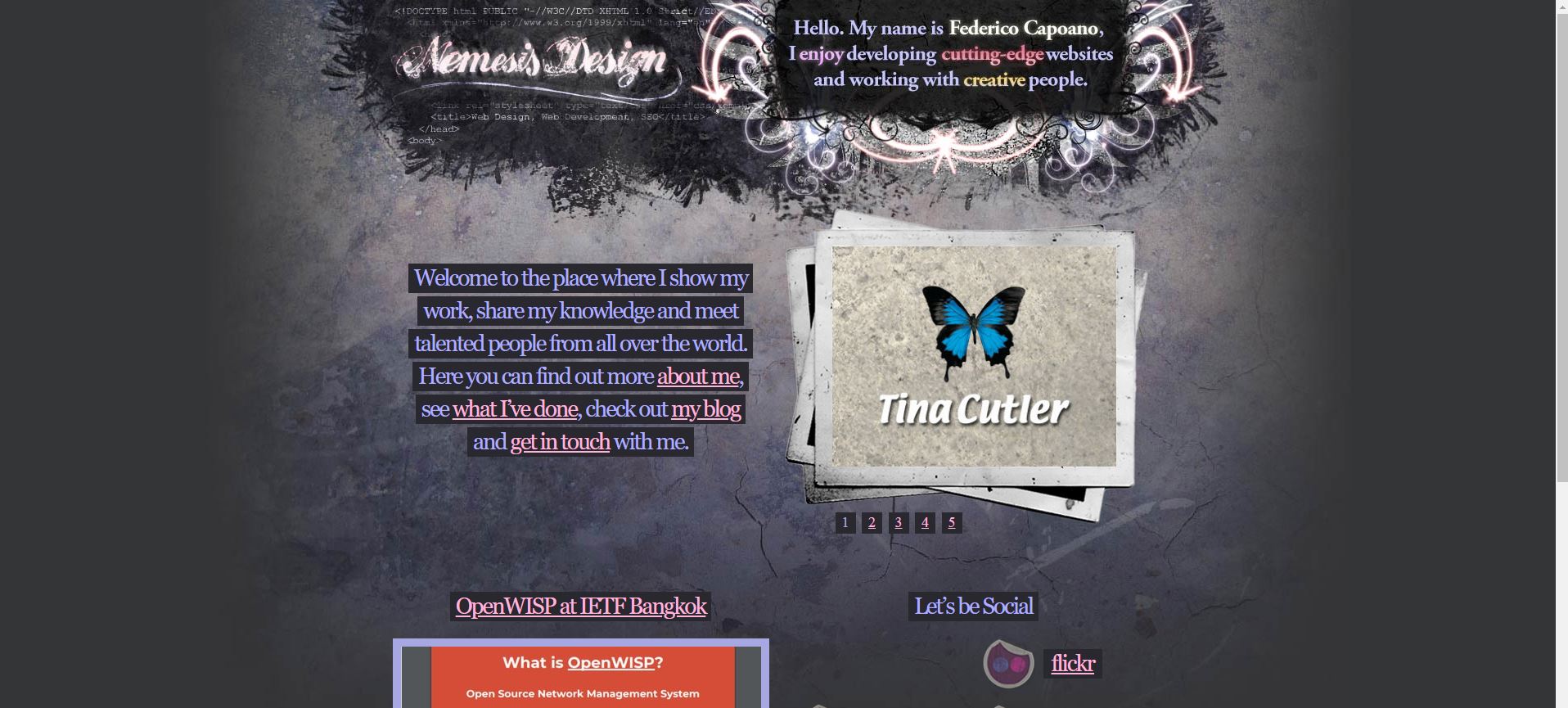
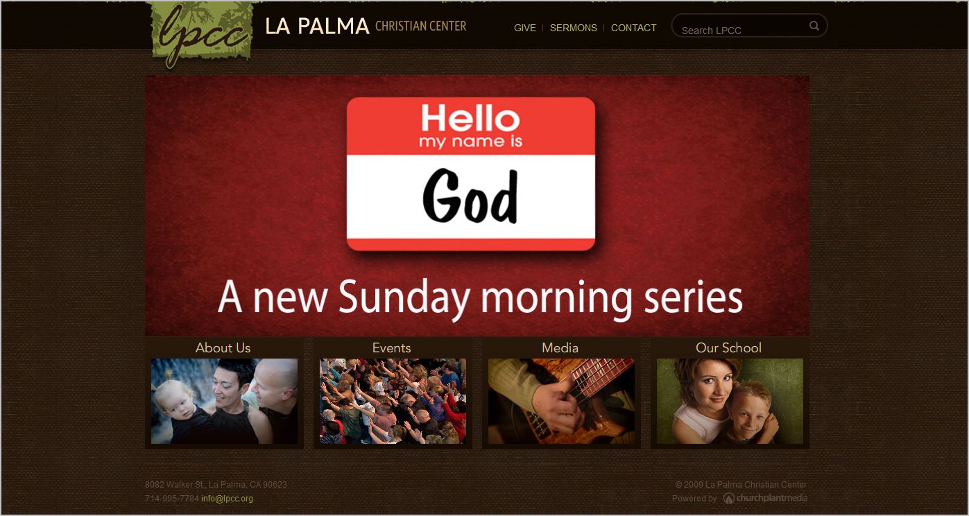
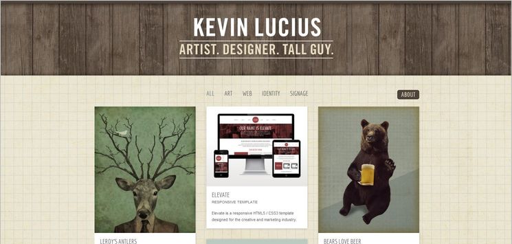
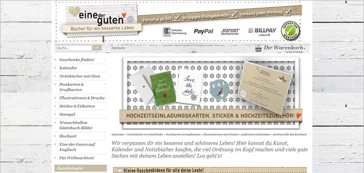
Grunge style is characterized by aged/dirty look and irregular crooked visual elements; such as textured/gritty backgrounds, torn/jagged edges and worn/faded out graphic elements. The look of a Grunge web style usually seems a little bit messy and untidy, but it is part of the appeal. Textures are usually of different materials; from fabric, paper and wood to metallic surfaces. Historically, Grunge style comes from the design trend for music industry in 1980s when grunge style was initially characterized the processing of music albums and posters, and later in design of music bands' websites. This style is in direct contrast to flashy, glossy and rigid design elements which characterized Web 2.0. So this contrast reveals the essence of grunge style and speaks for itself. Grunge style has become a popular trend in modern web design in recent years. It is considered as one of the fastest growing styles.
In the hands of a skillful designer, grungy techniques can become a part of a meaningful artworks. For designers, it is an approach to express the tough, irregular and provocative nature of industrial society by utilizing crude, nasty, radical and even ugly, strange visual elements. Being less uniform and structured, Grunge style delivers a sense of reality; it gives the design a more natural and organic look. This design style can be achieved, however, even by using simpler and more regular elements. As an example, it can be done by simply replacing the layout's background image with a dirty texture; it is like you have spilled a cup of tea or coffee on a white sheet of paper. There is even a type of this style called Minimalist Grunge (where the theme is very minimal, apart from the grunge elements) which is not as messy as early incarnations. Being a relatively unstructured design form, Grunge web style offers designers tons of room for creativity and individual expression. It is among the most influential and cutting edge web design trends. Grunge is mostly used by design studios and portfolio sites.
Kalender
Crssrd
