Minimalist Website Design
Analysis & Showcase
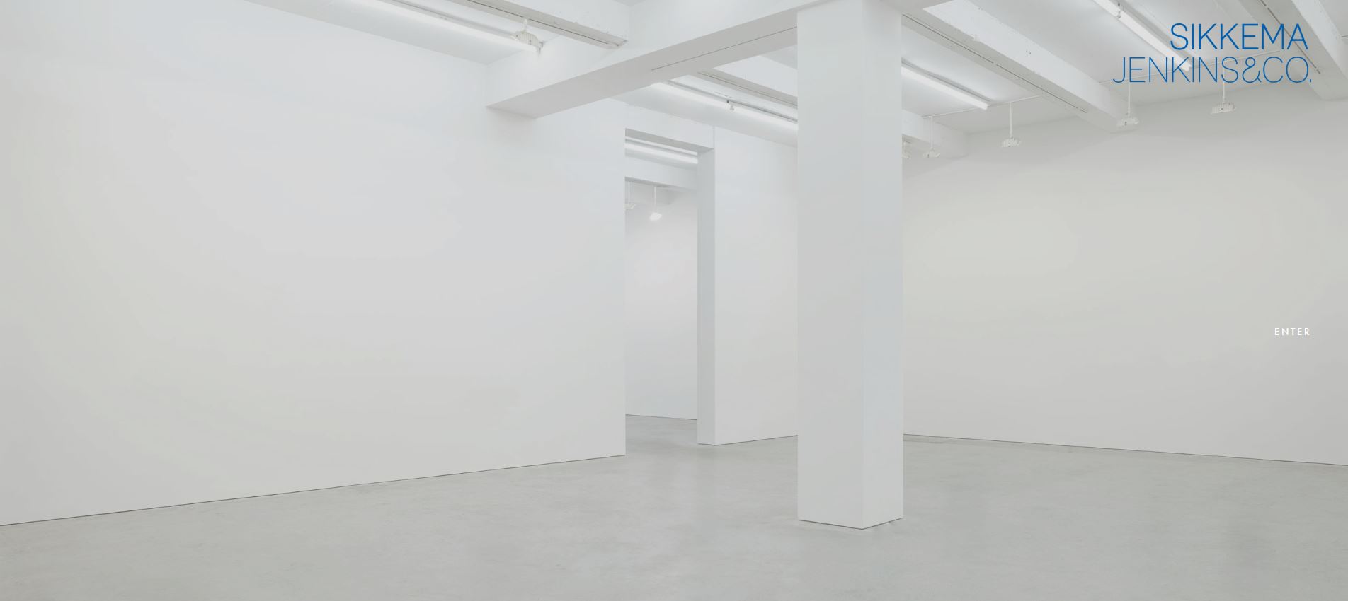
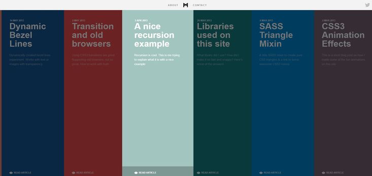
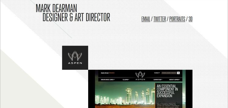
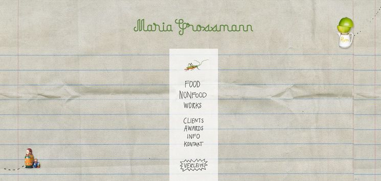
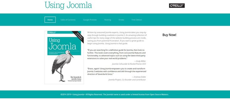
Minimalist web design is the most modest, simple and efficient website trend. It is a very simple design layout which uses a lot of negative space, but applies restricted design elements and color palettes. Regarding a design layout's look and core structure, it is the most decent, usable and function-oriented web design style. As a matter of fact, those few design trends which appeared in recent years (including flat design, large background images, and hidden global navigation) are all directly or indirectly influenced by Minimalism.
The History of Minimalism
Before we discuss application of Minimalism in web design, it is worth mentioning how this movement originally emerged. Minimalism's emergence and nourishment was hugely due to its inspirations of Bauhaus, the German art movement which focused on simple yet functional design. Less is more is the motto behind minimalism movement that was first stated by architect Ludwig Mies van der Rohe (1886 – 1969) — the third and last director of Bauhaus art school. He was a German-American architect whose architectural style during post-World War I laid the groundwork for Minimalist design. Another motto was from designer Buckminster Fuller: doing more with less. Minimalism is achieved by reducing things to only the most essential elements; no matter if you are designing a piece of art, a house, a poster, or a website. All the unnecessary elements have to be stripped away until nothing else can be taken away without interfering with the purpose of the design. Expressions of Minimalism transcend different fields, such as literature, philosophy, law, visual art, music and especially architecture. In arts, Minimalism has its roots in the post-World War II era (1960s and early 1970s). It started by prominent artists associated with this movement such as Donald Judd, Carl Andre and Robert Morris.
Why Minimalist design trend is Growing?
Minimalist design is the most significant design movements of the 20th century and early 21st century. Already at the end of the twentieth century, minimalism began to take shape as an independent design trend within the area of human–computer interaction. In the beginning of 2000s, imitations of the Minimalist art movement started to appear in web design. It became even more popular and in demand in 2010 by emergence of Responsive Web Design (RWD) which prized a Minimalist approach. And the story went on; more users and designers showed interest towards greater simplicity in web interfaces. This shift of preference was accentuated when two industry giants, Microsoft and Apple, carried out major redesigns of their products in 2011 and 2013 respectively. Google is credited as the pioneer of minimalist web interfaces. Since its beta introduction in the 1990s, the company has emphasized on simplicity as the main criterion in its interfaces.
the objective of Minimalist design technique
Minimalism is more of a principle than just a visual design. It is about harmonizing of design with function. The objective of minimalist web design is to present content and features in a simple and direct way by providing as little distraction from the essential content as possible. It means taking off all unnecessary items and focusing on what needs to be there. What you choose to leave in is vital; every detail has significance. Hence, this approach includes removing any content or feature that does not support the primary purpose of the interface or its users.
the features of Minimalist website design
There are a few common features that distinguish a web design as Minimalist. The following are the basic characteristics of a Minimalist web design style:
- White Space:
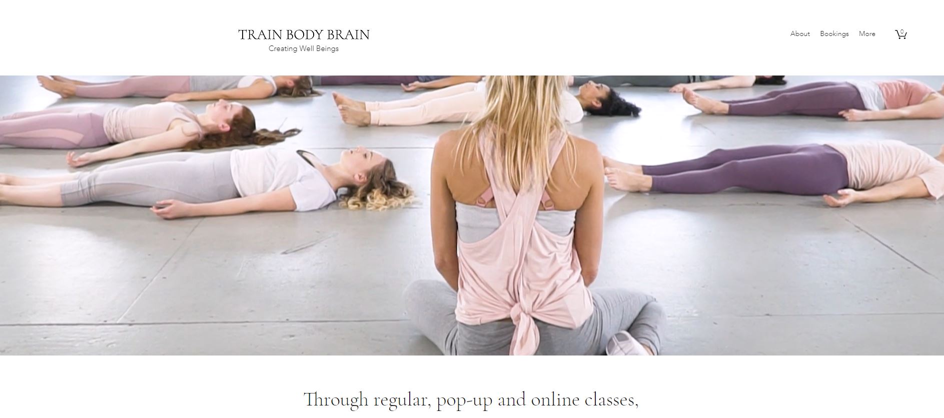
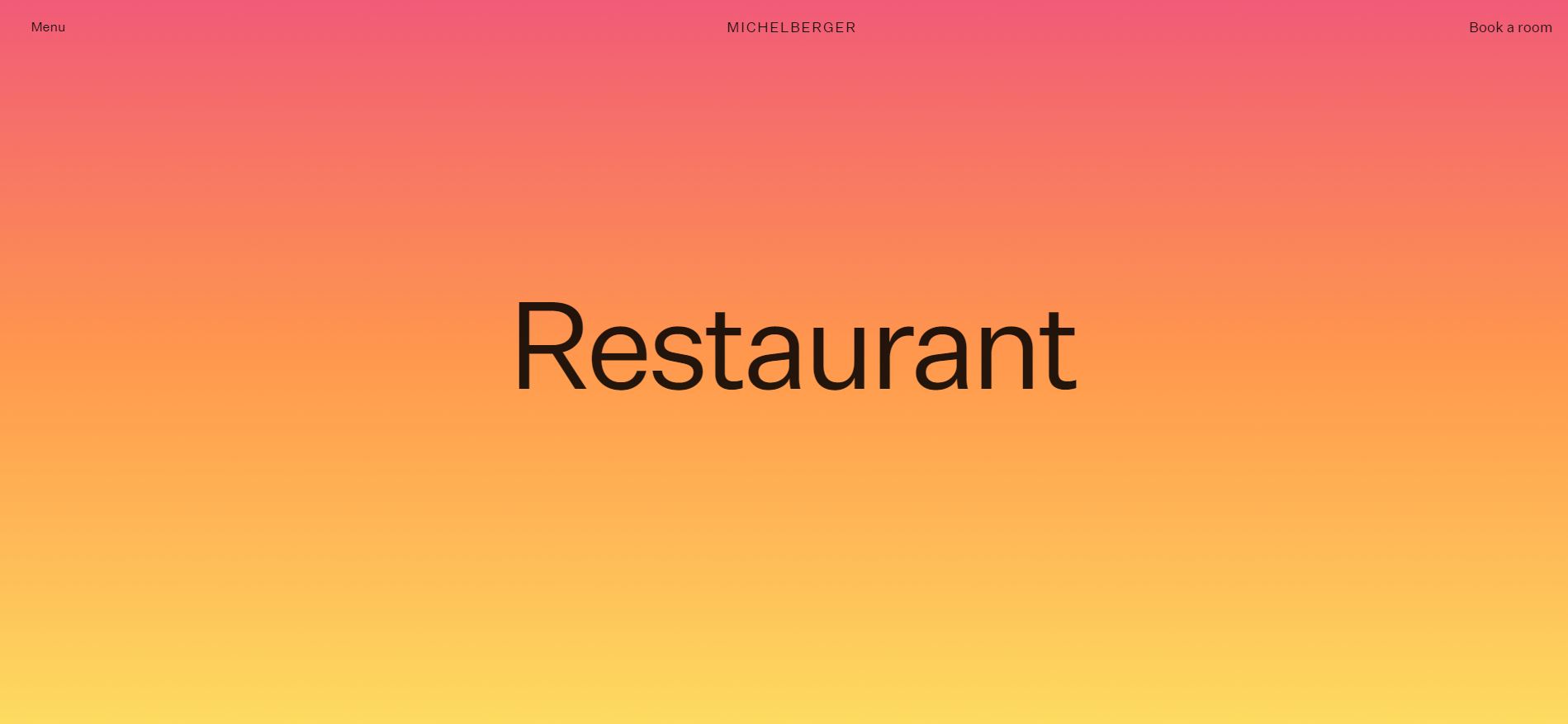
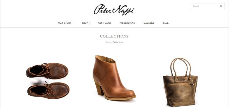
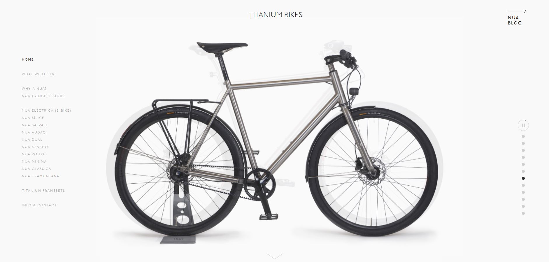
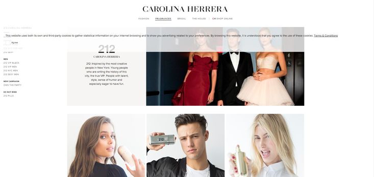
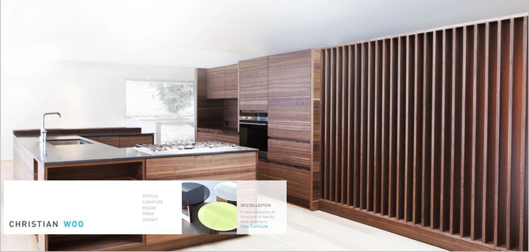
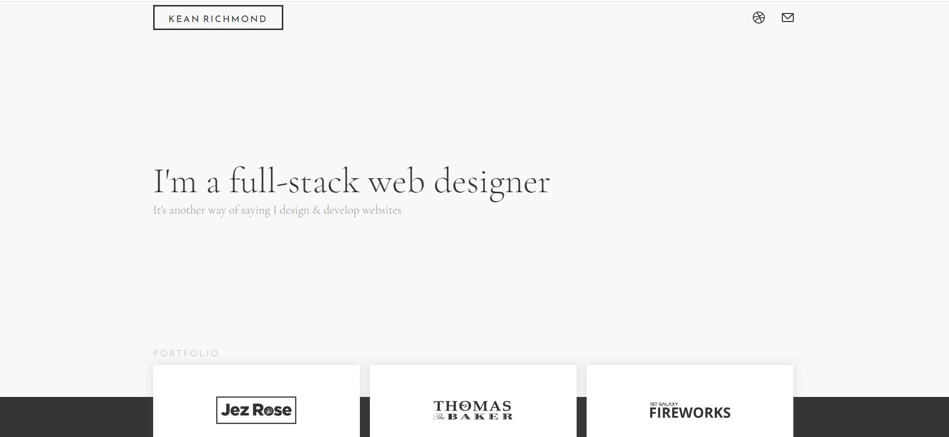
The primary design element associated with minimalism is white space (or negative space — if another color than white is used as background.) - Limited color palette:
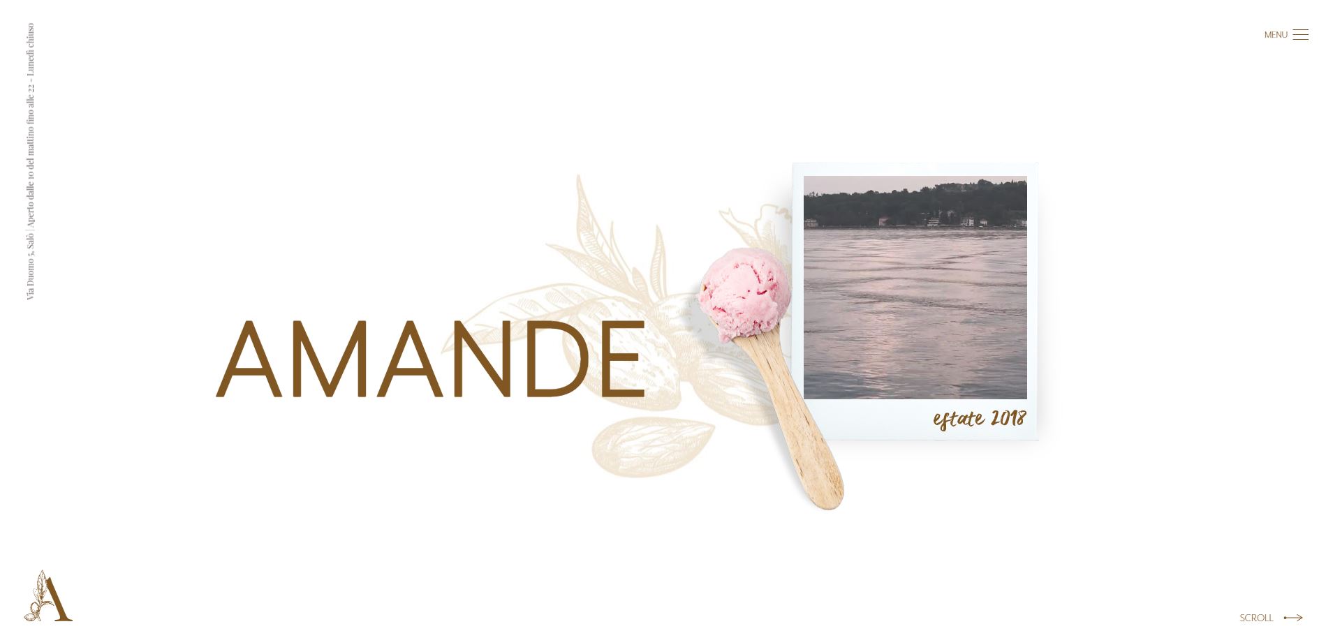
Use of a minimal number of colors on a web page is the basic rule in Minimalist design strategy. - Content First:
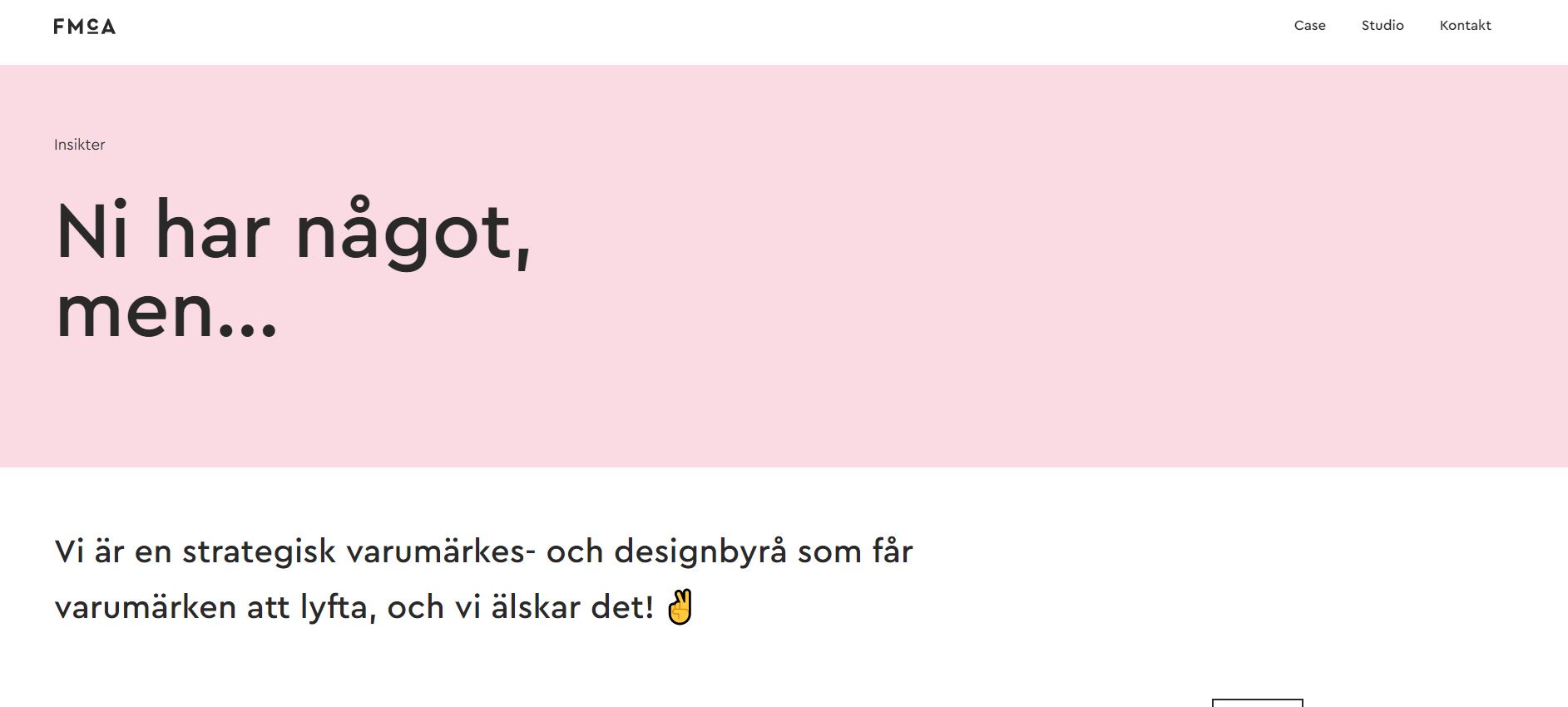
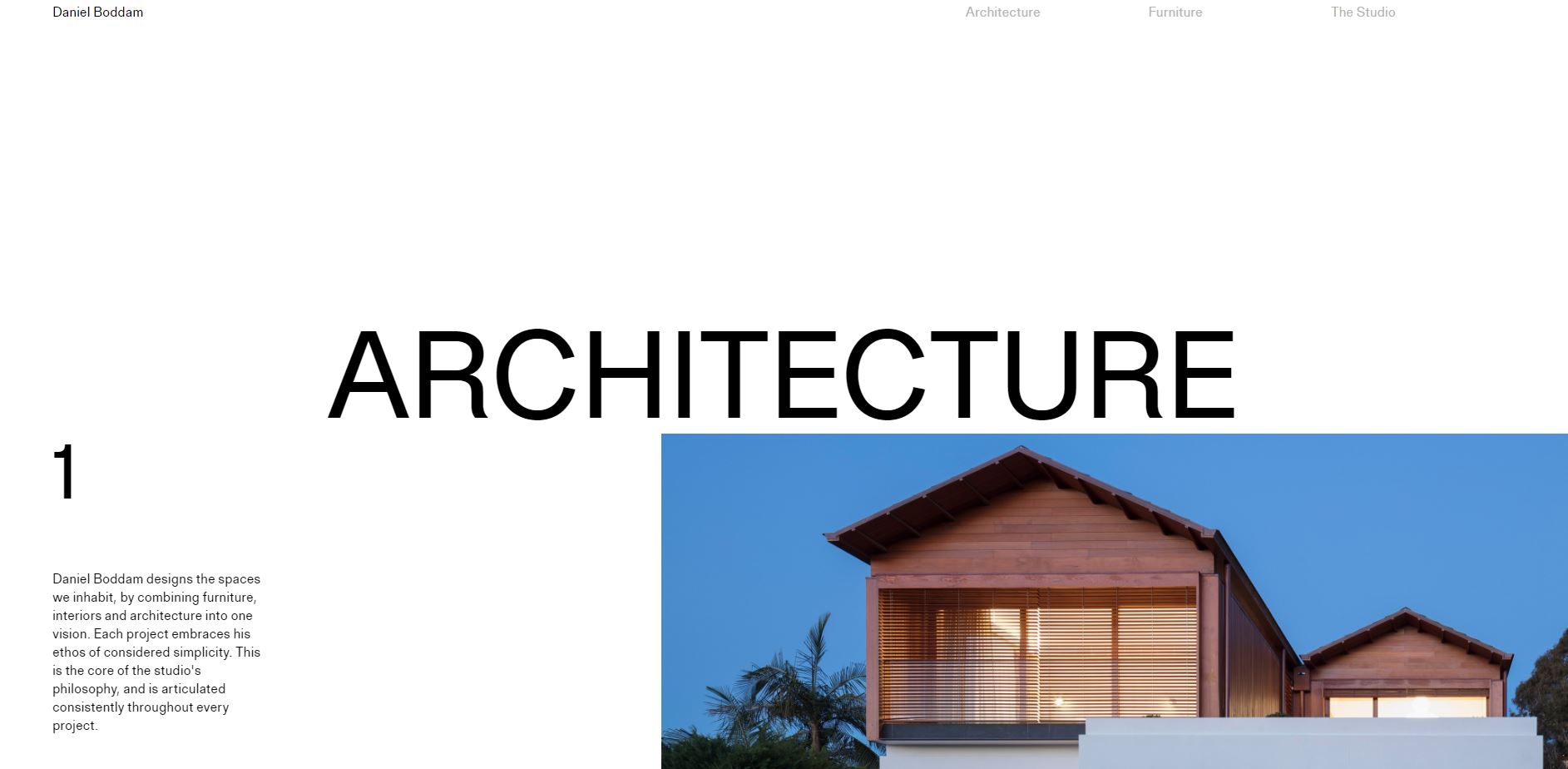
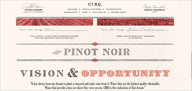
Design is focused on the content, without any element that distracts from the core content. - Effective Typography:
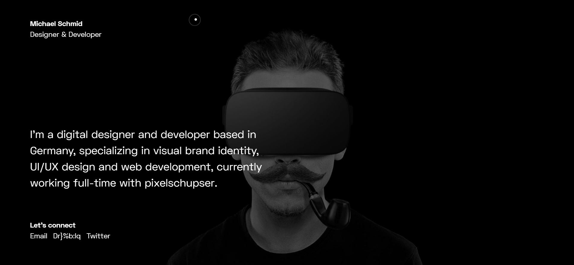
While it communicates hierarchy by substantial use of impressive typography — playing with different fonts, dimensions and weights — it creates visual interest as well. - Text-based Logos:
A monogram or a word-mark logo, according to Wikipedia, “is a motif made by overlapping or combining two or more letters or other graphemes to form one symbol.” - Flat Design:
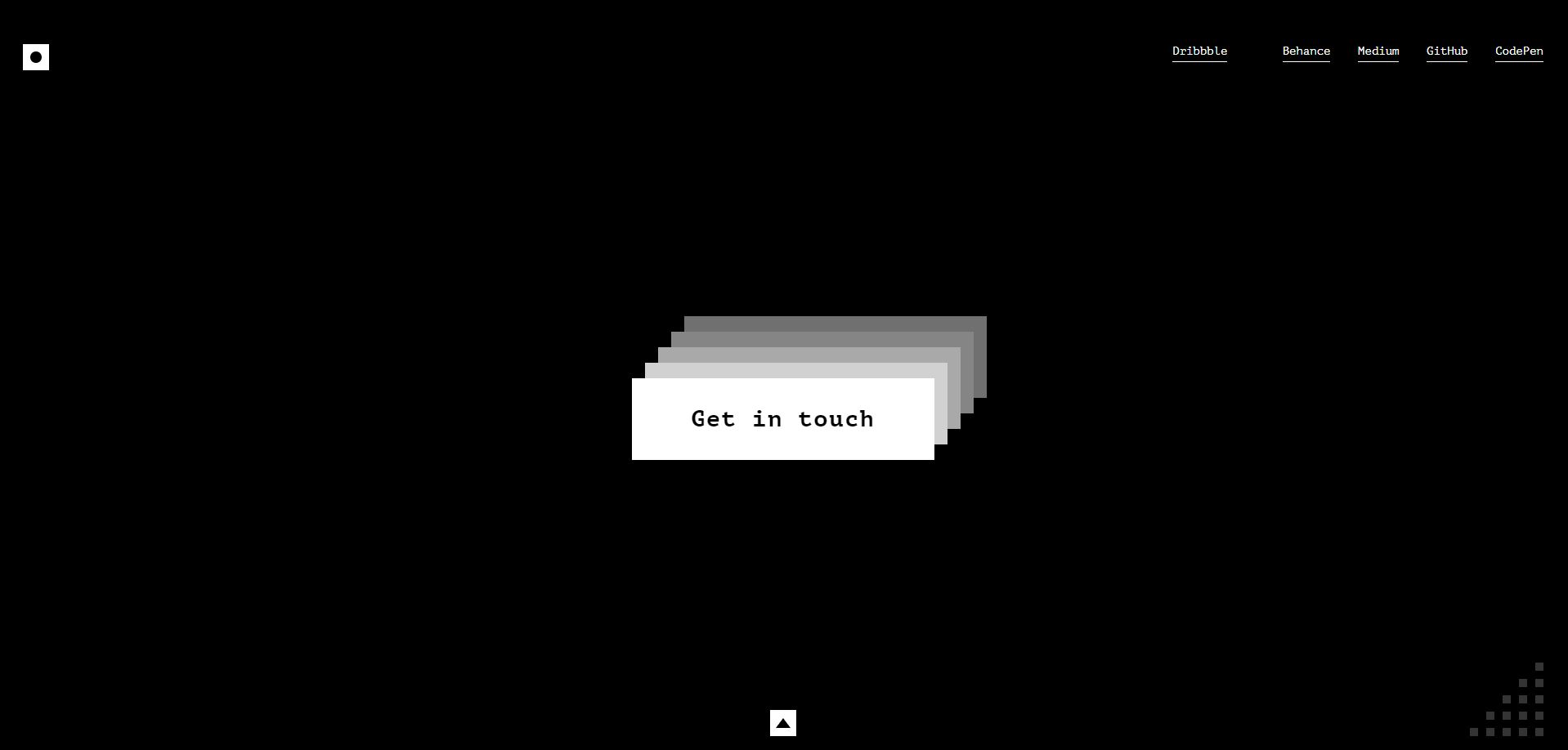
Flat design is an important attribute of Minimalism. Therefore, there are clean right angles and lines in use. - Simple Navigation
Minimalist websites features very clean and simple menus. - Simple Large Images:
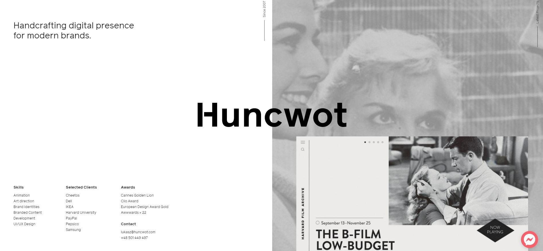
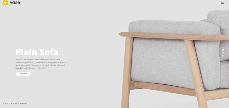
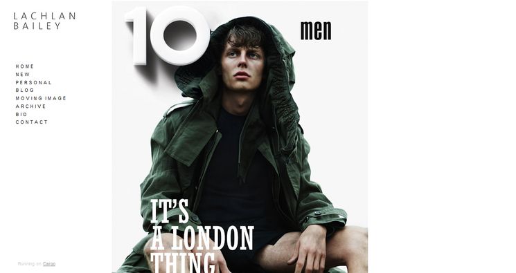
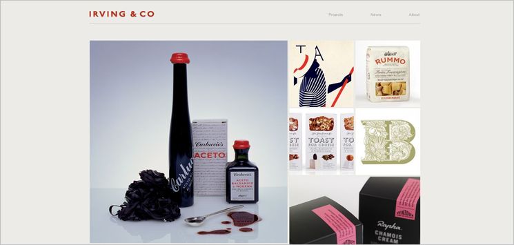
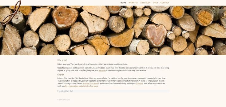
If images are included as visual appeal, they are simple (less detailed), monochrome, large and preferably high textured photos, also not too vivid.

